


📊
Over the last few years, there’s been plenty of noise online about whether COVID-19 vaccines had any impact on death rates. Some people have gone so far as to steal private datasets to make their case. But as it turns out, we don’t need stolen data. New Zealand’s publicly released official records can already show us a lot — if we’re willing to look closely and carefully.
This article walks through a simple, visual analysis of how all-cause deaths were distributed across time, depending on how long it had been since someone received a COVID-19 vaccination. No models. No assumptions. Just numbers.
🧾 The Data
This analysis used the following publicly available datasets released under the Official Information Act:
- All-cause mortality by dose number and time since vaccination
(via OIA – two separate OIAs showing: Date of death, time since last vaccination, age, and last dose number received (1-8), with the other also including the 0-dose mortality) - These record how many people died, grouped by:
- What dose number they’d last received (0, 1, 2, 3, 4, or 5+),
- And how many days had passed since that last dose.
Some entries are lightly anonymized — for example, any death count fewer than 6 is marked as “<6”. For those, we used two interpretations: one where “<6” = 1 (the minimum possible), and one where it equals 3 (the average value within that suppressed range). Both are shown side-by-side in the final chart.
⌛ What’s a “Bin”?
Rather than looking at each exact number of days, we group them into broader time buckets, or “bins.” These are:
- 0–30 days
- 31–90 days
- 91–180 days
- 181–365 days
- 366–729 days
- 730+ days
Each bin tells us how many deaths occurred in that time window after a person’s most recent COVID-19 dose. Think of it like sorting receipts into folders based on how long ago you made the purchase.
🔄 How the Curves Were Built
- We grouped all deaths by dose number (e.g., Dose 1, Dose 3, etc.).
- We broke down those deaths into the time-since-dose bins.
- Then we converted those into percentages — so for each dose group, we can see how the deaths were distributed over time after the dose.
This helps us spot any clustering of deaths shortly after vaccination — or whether deaths were evenly spread out.


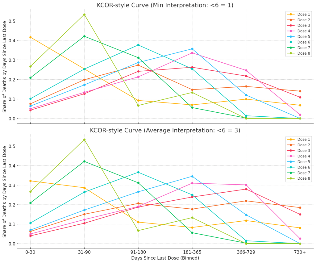
📉 The Results: What the Curve Shows
Once we break down the deaths by time since vaccination, some patterns emerge:
- For the highest dose numbers (especially Dose 6 through Dose 8), we see a clear concentration of deaths in the first 90 days after the dose — particularly in the 0–30 and 31–90 day ranges.
- For mid-range doses like Dose 3, 4, and 5, the peak tends to shift later — with the largest share of deaths appearing between 91 and 365 days after vaccination.
- After about a year (the 730+ day bin), the proportions drop to near zero for all groups — which makes sense, as not many people reached those timeframes yet, especially for the more recent booster rounds.
This doesn’t necessarily tell us why deaths were more common during certain time windows, but it does show that they weren’t evenly spread out. Some time periods saw notably more deaths than others — and that pattern changes depending on which dose was most recent.
Importantly, the shape of the curve is not flat, which is what some commentators have said we “should” expect if the vaccines had no time-linked relationship to mortality at all.
But does this prove causation? No. This is descriptive — not causal — analysis. It shows us what happened, not necessarily why.
🧠 Why This Matters
Rather than relying on leaked spreadsheets or emotionally charged headlines, we can use legally released, high-quality public data to calmly investigate important questions. This kind of structured, transparent analysis helps us move past speculation — and toward understanding.
If there’s one takeaway here, it’s this: the data can speak for itself — if we ask honest questions (in the specific, correct syntax and format so as to not allow HNZOIA to invoke any of the clauses in the Act that allow refusal to release information) and listen carefully to the answers.
📝 Note: Why You Shouldn’t Expect a Flat Line
Some commentators have claimed that if a vaccine were safe, the curve showing deaths after vaccination should be perfectly flat — meaning deaths would be spread out evenly across all time periods after the shot.
That’s not how real life works.
In the real world, no group of people dies at a perfectly constant rate over time — not after a vaccine, not after surgery, not even while doing nothing at all. People are different ages, with different health risks, and they go through changing seasons, events, and illnesses. Some doses are given in winter. Some are given to very sick people. Some people die a week later, and some live another five years.
So yes, the line has shape — and it always will. That’s not a red flag. That’s reality.
⚠️ The Problem with the Stolen Dataset
Before it was suppressed by court order, the so-called “leaked” dataset showed deaths following COVID-19 vaccination — but only for a subset of the program: the pay-per-dose scheme.
What most people weren’t told is that this scheme didn’t cover the general population. It primarily included mobile vaccination teams — the kind that visited aged care homes, hospices, and end-of-life facilities. These teams were vaccinating people who were already near death, often in palliative care.
So yes — those people died in high numbers, because that’s what happens in facilities designed for people nearing the end of life. To compare that mortality rate to the general population, without explaining the difference in who was being vaccinated, is statistically misleading at best, and deliberately deceptive at worst.