


*Originally published April 2023. * Updated May 2025 with StatsNZ data that became available February 2025 – Note: all data herein is raw. There is no modelling or ASMR involved, nor was there any need to steal and distribute private medical data. It was all public. It was all there, available to anyone with an internet connection, as early as 2023. OECD database + the HSU spreadsheet. Anyone could have made these charts to the date that OECD had Mortality data for, at any time. Anyone.
Here’s the links to the sources of the data, should you wish to do your own comparison and see how easy it is.
Vaccine Rollout: HNZ, from the Wayback Machine. Two options: Copy the data from every Vaccine Data page, or for the period Feb 2021 – May 4, 2023, you can use the HSU spreadsheet that is at the bottom of that page up to May 4 2023. Be aware there’s a step down of several thousand dose 1 and 2 (HNZ can tell you why, OIA them) to account for, but HSU is more accurate for Dose 3 and 4’s initial rollout. Vaccine Data does not include them for weeks after they begin.
Mortality Data: from StatsNZ. You want “Provisional weekly deaths registered in New Zealand from 9 January 2000–26 January 2025” – use this to calculate the baseline you want to compare any given week’s Mortality to. I used a 5-year rolling average, so any excess deaths for 2022 are included in the average for 2023 etc. OWiD uses 2015-2019, a fixed window.
Now you have your Vaccine Rollout all plotted by dose, and your Excess Mortality for 2021-2025, you just have to do some comparisons. It’s kind of fun. Oh, not compiling the Rollout. That’s hours of painstaking manual work because you want to know it’s accurate. Comparing it to the Mortality, now that’s fun.
From the beginning, we were told to take the vaccine because it would protect us and others, and that it was “Safe and Effective”. This article touches on the Effective side of things but leans more into the “Safe” side of the claim.
Introduction
New Zealand’s strict elimination strategy for Covid-19 has frequently been lauded for saving lives. Public commentary often points to Our World in Data’s projection-based series—as originally estimated by Karlinsky & Kobak (2021)—showing negative cumulative excess deaths through mid-2023, implying that “fewer people died than would have in a normal year.”
This is somewhat nullified by the fact that most people point to that chart “when compared to Projections” – a version of the Mortality based on models and guesses on what it might have been, essentially it shifts the x-axis up so the excess deaths are, in many cases, dropped below zero to become negative excess deaths (or “fewer people died than we would have thought would”).
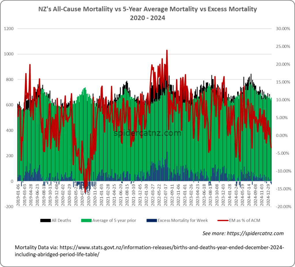
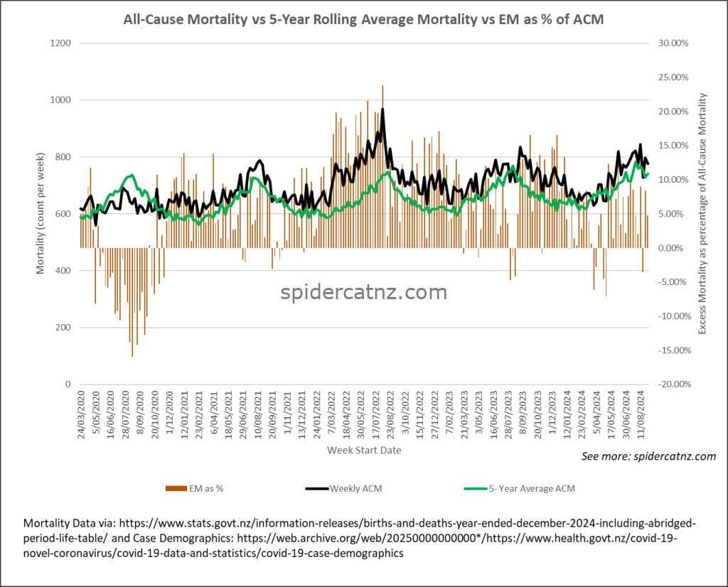
Fortunately, StatsNZ now (annually? There’s only been one) releases Weekly Mortality figures that can be used to calculate the ACTUAL difference in the number of dead kiwis compared to the AVERAGE of the last 5 year period. (Note: Our World in Data uses a baseline for their Excess Mortality of 2015-2019. I am using a rolling 5-year average.)


As it turns out, when we account for the near-halt in population growth after the March 2020 border closures, true cumulative excess mortality through 2022 is significantly above expected deaths. This article revisits the data, updates the figures to January 2025, and examines key methodological flaws and ethical considerations.
Data Sources & Methodology
- Mortality:
Weekly and annual all-cause death counts from the OECD’s mortality database, 2020–2023 (latest data to October 2023).New Weekly Mortality figures from StatsNZ (back to 2000, so we have quite the backstory). - Population: Estimated resident population from Stats NZ’s official “Population” dataset, which documents New Zealand’s population growth slowing from about 2 percent p.a. pre-2020 to near zero after the border closures Stats NZ.
- Vaccinations: Daily dose counts (first, second, first booster, second booster), reclassified to include third primary doses as booster 1 from their start date.
- Media Framing & Population Growth Obfuscation: Major outlets like the NZ Herald headlined “New Zealand records biggest increase in registered deaths in 100 years”—which is factually driven by a 2% annual population growth pre-2020 and the subsequent rebound post-border closure. (nzherald) While accurate in raw terms, this emphasis on absolute death counts can obscure true excess mortality: without situating these figures against age-adjusted expected baselines and accounting for demographic shifts, readers may mistake a normal population-driven rise for pandemic-related abnormality.
- Excess Mortality: Calculated as actual minus expected deaths under two approaches:
- Simple trend extrapolation (2015–2019 semi-log regression, ignoring population changes)
- Population-adjusted projection, which corrects for the 2020 migration shock.
Update: All charts now extend through January 2025, showing continued positive excess mortality despite high vaccine uptake.
Age-Standardised Mortality for a Novel Pathogen
Age-standardised mortality rates (ASMR) are designed to compare death rates from well-studied causes—like heart disease or cancer—where long-run, age-specific mortality patterns are reliably measured, and differences in population age structure can be “factored out” Stats NZ.
For a truly novel virus such as SARS-CoV-2, however, there is no pre-pandemic “normal” Covid-19 death rate on which to base those age bands. Early Covid infection-fatality-rate (IFR) estimates varied dramatically—from under 0.1 percent in children to over 15 percent in those 85+—and were constantly revised as new outbreak data arrived Stats NZ.
Applying ASMR methods to Covid-19 (as was done to create the Our World in Data “Excess Mortality Compared to Projections” chart) without a stable, historical age-specific baseline therefore embeds the very uncertainty you’re trying to measure, risking both under- and over-estimation of excess deaths.
Official Commentary & Quotes
- Jacinda Ardern, Prime Minister (Feb 2022): “Our response saved thousands of lives, as seen in our low mortality rates compared to projections.” (1News)
- Chris Hipkins, Prime Minister (Mar 2023): “While we’ve seen some increases in all-cause mortality post-restrictions, this reflects the first true Covid waves and our ageing population; overall our policies mitigated far worse outcomes.” (apnews.com)
- David Seymour, ACT Leader (May 2023): “Over the last three years, in Our World in Data put together by the University of Oxford, New Zealand still has negative excess deaths.” Cumulative excess death…
- Sir Ashley Bloomfield, former DG of Health (Mar 2023 interview): “We had less deaths than you would have predicted based on the previous years … [which] is unique, virtually unique around the world.”
- Professor Michael Baker, University of Otago epidemiologist: “Unlike other OECD countries, New Zealand had not recorded any excess mortality (deaths above and beyond the ‘normal’ rate) over the initial years of the pandemic.” (nzherald.co.nz) (apnews)
- Dr Mike Plank, Victoria University modeler: “New Zealand has also experienced lower excess mortality during the pandemic than most countries. The reason is simple: most New Zealanders were vaccinated before coming into contact with the virus.” (apnews.com)
- Dr Ayesha Verrall, then Associate Health Minister, asserted the success of multiple interventions: “Vaccination has played a key role, along with border and isolation measures, in keeping people safe from the more deadly variants by limiting their spread.” (wsws.org).
- David Hood, Stats NZ analyst has argued for age-standardised mortality to compare countries, but his preferred ASMR series also relies on projections that ignore rapid demographic shifts; as Hood himself notes, New Zealand’s unusual age-structure changes make such direct comparisons misleading. Stats NZ
- Dr Siouxsie Wiles, University of Auckland microbiologist: on RNZ in Sept 2022, warned that “’No excess deaths’ would be a decidedly underwhelming ambition for New Zealand… any claim of net lives saved must consider delayed respiratory infections and long COVID burdens.” (rnz.co.nz)
- Dr Helen Petousis-Harris, vaccine researcher: in May 2023 cautioned that “excess mortality rates should be interpreted alongside healthcare disruptions, long COVID impacts, and demographic shifts—not as standalone proof of net lives saved.” (apnews.com)
Excess Mortality Trends, 2020–2024
| Year | Cumulative Excess Deaths | Notes (vs. 5-yr average) |
|---|---|---|
| 2020 | –174.8 | Negative early in year, then offset by late-2020 spike |
| 2021 | +1,991 | Six weeks below baseline; remainder positive |
| 2022 | +4,814 | Every week above baseline; worst week +231 deaths (33.8 %) |
| 2023 | +3,216.6 | All but 6 weeks of year above baseline. |
| 2024 | +1,544.8 | 8 weeks below baseline, remainder above. |
| 2025* | -14.2 | Only available to 26 January. |
*StatsNZ data up to end January at time of publication.
Total excess deaths to end 2024: ~11,400 above 5-yr average.
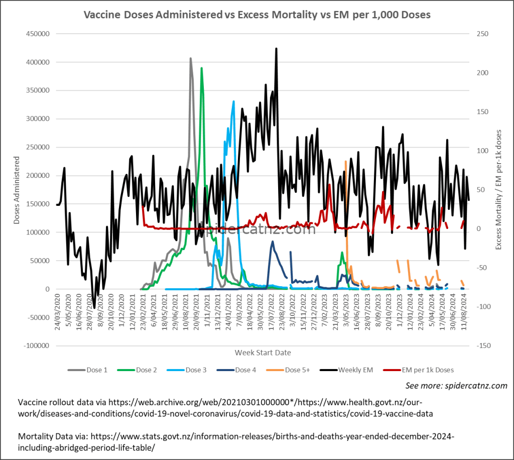
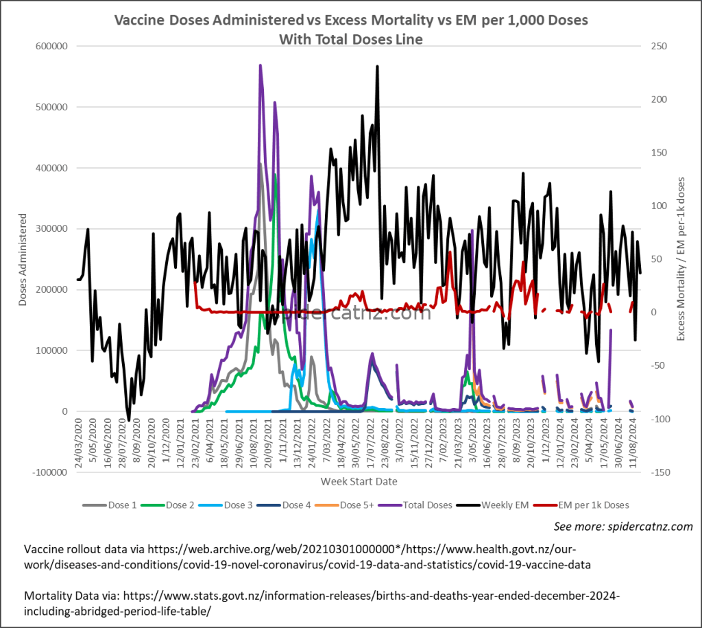
Vaccination Rollout vs. Excess Mortality
- Total doses administered (to 15 December 2024): 13,505,269
- Excess deaths per 1,000 doses: 0.84
Despite over 13.5 million vaccine doses, New Zealand has seen sustained positive excess mortality—about 0.84 deaths per 1,000 doses administered (with very large peaks in Q1/3,4 of 2023. The timing of the first booster campaigns and subsequent peaks in excess deaths do appear to align perfectly, using ye-old Pirate method of “holding both pieces of paper up to the light and moving them slightly until they match), suggesting the “other factors (border policies, seasonal influenza resurgence, healthcare access) could also play roles” argument may be a little thin, for that specific peak at the very least.
Modelling and Limitations
In July 2024, statistician David Hood emphasised that any true assessment of pandemic-era mortality must adjust for New Zealand’s ageing population and growth. In a peer-reviewed commentary, he wrote:
“Analyses should use age-standardized data, and when [I] do this for New Zealand, [I] find negative excess mortality of −2 percent.”
On his X feed, Hood further noted:
“You don’t need to remove the covid deaths—even with Covid the age-standardised 2022 (the worst single post-Covid year) is below 2017 (with the standard year Stats NZ has always used). Big behavioural changes reducing respiratory illness showing up more this year after the 2022 exit wave.”
Hood’s argument underscores that age-standardisation—which applies a fixed reference population structure to remove the effects of demographic change—can yield different insights than raw counts. However, his ASMR series still relies on projection methods that ignore sudden shifts in migration and population growth (the same flaw he critiques in the K&K projections)
Moreover, without a historical Covid-specific baseline, the very choice of reference year and age bands remains inherently uncertain.
Age‑Standardised Mortality Ratios (ASMR)
Dr David Hood championed ASMR for comparing against other OECD nations. While ASMR accounts for age-structure, it presumes a “normal” baseline for a novel virus—an inherently unknowable quantity early in the pandemic.
“ASMR assumes a stable underlying mortality pattern—it cannot predict how a brand-new coronavirus might alter age‑specific death rates,” explains Hood (2024), underlining that any projection for COVID‑19 lacked a true pre‑pandemic analogue.
Expert Commentary on ASMR
Professor Michael Baker and Dr Mike Plank originally touted Aotearoa’s elimination strategy based on K&K projections: “Cumulative excess mortality in New Zealand … remains close to zero, underscoring our strategy’s effectiveness.” (rnz.co.nz).
Professor Shaun Hendy stood by public release of raw vaccination, case and death data, arguing that “there’s always uncertainty in modelling and this modelling is no exception—sharing the confronting information allows continuous improvement.” (nzherald.co.nz). Professor Hendy also commented about the limitations of modelling in an April 27, 2025 1News interview, saying “on Quality Adjusted Life Years (ASMR) ‘I don’t think we have a good tool.”‘
Human Impact and Ethical Considerations
Beyond statistics lie real lives—parents, grandparents, friends—lost or irreversibly altered. Reducing the pandemic to a ledger entry (“fewer deaths than expected because Covid targeted the elderly”) risks a cruel detachment. Each “excess death” was a person with loved ones left to grieve, and every life has intrinsic worth beyond demographic groupings. Responsible analysis must balance methodological rigor with empathy for those at the heart of these numbers.
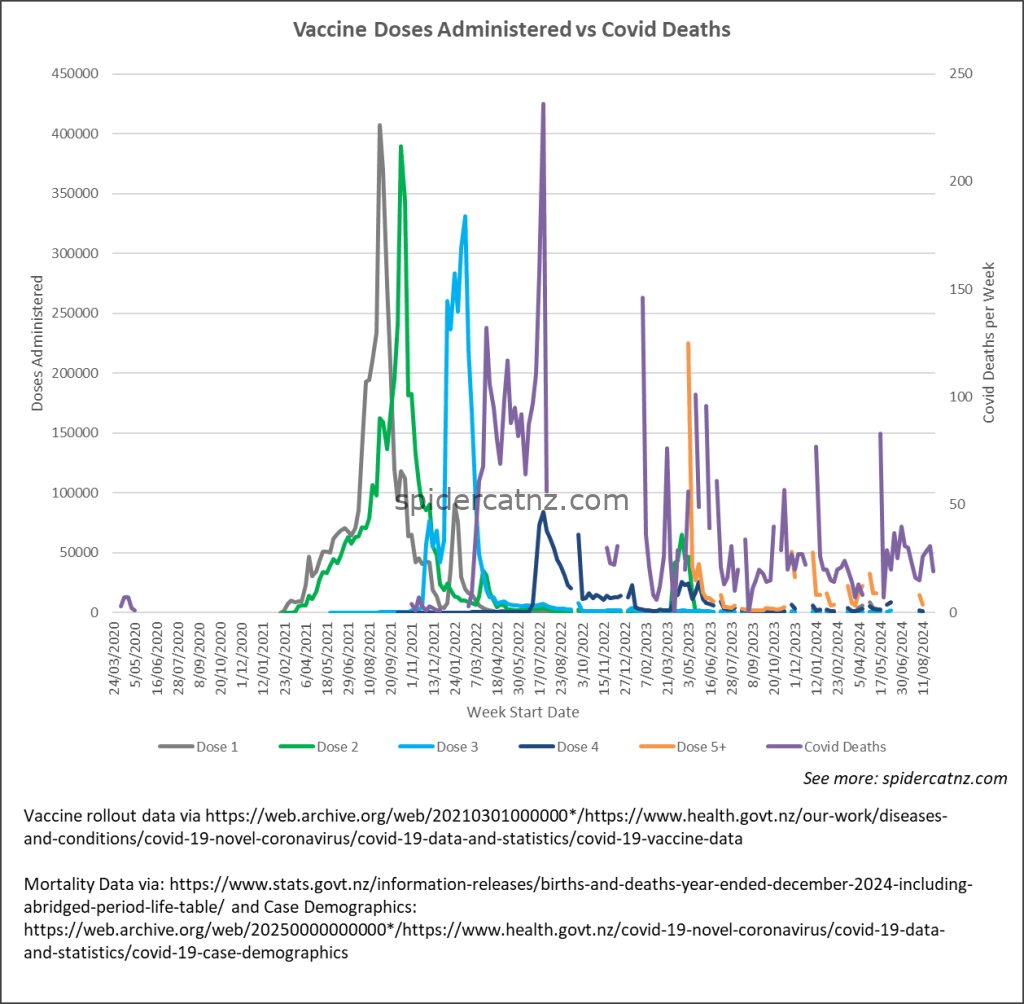
Discontinuation of Vaccination-Status Outcome Reporting
Through 2023, the weekly COVID-19 Case Demographics report included a full stratification of cases, hospitalisations, ICU admissions and deaths by vaccination status (unvaccinated, partially vaccinated, fully vaccinated and boosted)—enabling direct measurement of vaccine effectiveness across all severity endpoints..
In early 2024, the Ministry of Health removed every outcome breakdown by vaccine status. The current Case Demographics page lists only aggregate case counts by age, sex and region, with no columns for vaccination status at any severity level.
As a result, anyone wishing to analyse outcomes by vaccination status must now lodge a formal data request—for example, dataset request #1011 on data.govt.nz—to obtain weekly hospitalisation or death counts by dose group. That request itself notes that “some of this data used to be available … but data on COVID-19 and vaccinations has progressively narrowed” and that death data are limited to the “death within 28 days of a positive test” metric, rather than underlying-cause breakdowns by vaccination cohort Data.govt.nz.
This withdrawal of routinely published vaccination-status outcomes prevents real-time assessment of how well each dose level protects against severe disease and makes it much harder to detect changes in effectiveness—just when such insights are most critical.
Conclusion
New Zealand did not “escape” the mortality impact of Covid-19. Once population growth shifts are accounted for, true cumulative excess deaths through 2023 are clearly positive, about 7 percent above expected baselines as of January 2024 (total mortality for period – 5-year average for period / 5-year average for period), and continue rising. Reliance on projection-based series that ignore demographic shocks has led to misleading claims of “zero or negative” excess mortality.
Key References
- Gibson J. (2024). Cumulative excess deaths in New Zealand in the COVID-19 era: biases from ignoring changes in population growth rates. New Zealand Economic Papers. Cumulative excess death…
- Stats NZ. Population. Estimated resident population as at 31 December (annual growth rate). Stats NZ
- RNZ interview with Sir Ashley Bloomfield (Mar 25 2023).
- Hood D. Age-standardised mortality critique (2024).
- Ioannidis JPA et al. Age specificity of Covid IFR (2020).
Sources:
- StatsNZ – Weekly Mortality Table
- Ministry of Health – Vaccine Data
- Ministry of Health – Case Demographics