In the realm of public discourse around COVID-19, vaccination, and mortality, few things are as revealing as the reaction to simple data. Per-capita charts, line graphs, dose schedules overlaid with outcome curves – these are not inflammatory by nature. They are tools of clarity. Yet for many, the act of sharing such charts has become provocative, even offensive.
Why?
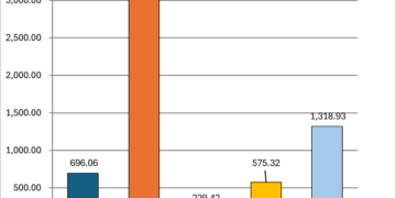
Why does a neutral chart showing COVID-19 case rates per capita by vaccination dose group provoke accusations of being “anti-vaccine,” or even “pro-Covid”? Why do individuals who once called for open scientific dialogue now dismiss data out of hand? The answers lie not in epidemiology, but in psychology.
Cognitive Dissonance: The Mental Alarm Bell
At the heart of the reaction is cognitive dissonance: the psychological discomfort experienced when new information clashes with deeply held beliefs. For someone who accepted every dose offered and believed they were doing the right thing to protect themselves and others, a chart that shows higher COVID-19 case rates among highly dosed individuals feels impossible. It’s not just a statistic – it’s a challenge to their integrity, their trust in institutions, and even their identity as a responsible citizen.
To reduce this discomfort, many unconsciously reject the data. They deny it, attack its source, or distort its implications. “That’s anti-vax propaganda” becomes a shield against the destabilizing possibility: “What if I was misled?”
Identity-Protective Cognition: When Facts Are a Threat to Self
For many, vaccination status became an identity marker. In New Zealand, as in many countries, it was linked with being a good neighbour, a team player, and someone who “believed in science.” Challenging the narrative around vaccines is then seen not as an intellectual act, but a moral transgression.
When data contradicts this identity, it’s not received neutrally. It is treated as a personal attack. Charts showing unvaccinated groups with lower per-capita hospitalisations or deaths aren’t seen as information – they’re interpreted as heresy.
Sunk Costs and Moral Investment
The more someone has invested in a belief, the harder it is to walk away from it. For those who championed mandates, ostracized the unvaccinated, or publicly declared their certainty, the emotional and reputational cost of admitting error is immense. The belief must be protected, not because it is true, but because the alternative is too painful.
Motivated Reasoning and Confirmation Bias
Instead of asking “Is this true?”, people often ask: “Does this fit what I already believe?” This is motivated reasoning in action. A chart showing rising all-cause mortality in certain dose cohorts won’t be examined for its method – it will be rejected because it doesn’t align with the dominant narrative.
Even those with the skills to understand the data may choose not to, because doing so would force them to revise a belief they’ve become emotionally attached to.
The Online Feedback Loop
Social media rewards tribalism, not nuance. Saying “I was wrong” gets no traction. Saying “this chart proves you’re a conspiracy theorist” gets applause. So people double down. The result? Even simple descriptive statistics become culture war weapons.
Data Is Not Allegiance
Perhaps the most important reminder is this: sharing data is not choosing sides. Pointing out that per-capita mortality was lower in the unvaccinated cohort during certain time periods is not “anti-vaccine.” It is simply a statement of fact. Facts do not owe allegiance to ideology.
The true measure of scientific literacy is not how well we memorize talking points, but how willing we are to update our beliefs when the data demands it.
Conclusion: The Way Forward
The longer we deny the psychological forces that shape our interpretation of facts, the further we drift from truth. If we want to build a society resilient to misinformation – from any direction – we must start by understanding why people reject data, and how to approach those moments with clarity, humility, and resolve.
You don’t have to be an epidemiologist or a “modeller” or a virologist to see what’s on the chart.
You only have to be honest enough to look.


