


I have been looking at the old data, the pages are still there but the graphs were lost in that horrible backup corruption drama. So, I figured it might be fun to present them in Flourish charts. Let’s start with the overall trends for Covid in New Zealand and I’ll see about the specific weekly ones later.
Remember how they had those nice charts on the RNZ page where we could see things by vaccination status? Spideycat Farms remembers.
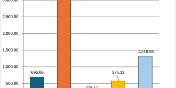
Covid Trends by Vaccination Status – April 2022 – December 2023
Cases
Monthly Cases
Cumulative Cases
Deaths with Covid
Monthly Deaths with Covid
Cumulative Deaths with Covid


ADVERTISEMENT