


As I step through the daily snapshots of the MoH/HNZ/TWO/HNZ data, sometimes I see strange things.
In 2023, there’s some massive spikes in Hospitalisations, as HNZ catches up on lagged cases, but way back in 2022..
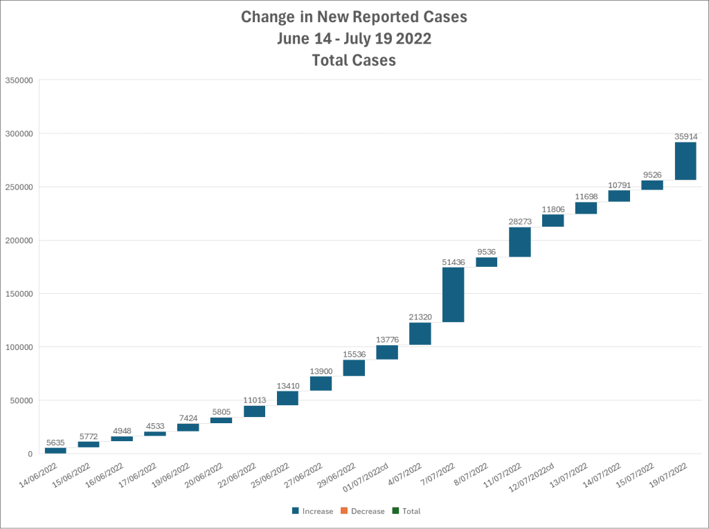
This strange thing was prompted by another thread, which was talking about the removal of the “Cases by Dose Count” chart on July 7, 2022. I had wanted to show the change in cases for that week per-capita, but ran into what looked to me like an issue. There were no updates on the 5th or 6th of July, which would mean we’d expect to maybe see 3+ x the daily increase for the 7th of July, a Thursday.
It wouldn’t be immediately apparent to anyone looking at total case increases..
But if we split it by cohort..
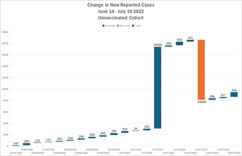
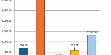
Between 4 July 2022 and 7 July 2022, the unvaccinated cohort jumps by 14,336 cases. It had been ticking along at around 100-200 per day, so that’s a fairly sizable increase. It then dropped between the 12th and 13th of July by 10,569 people. Net increase, about 5k between the jump and the correction.
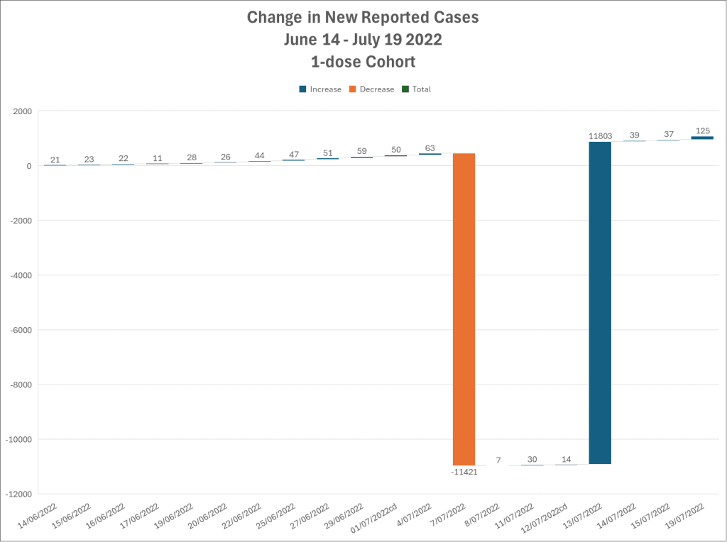
The 1-dose cohort DROPS by 11,421 cases on the 7th (making getting that first dose look pretty sweet!), only to pick them up 6 days later along with 400 more.


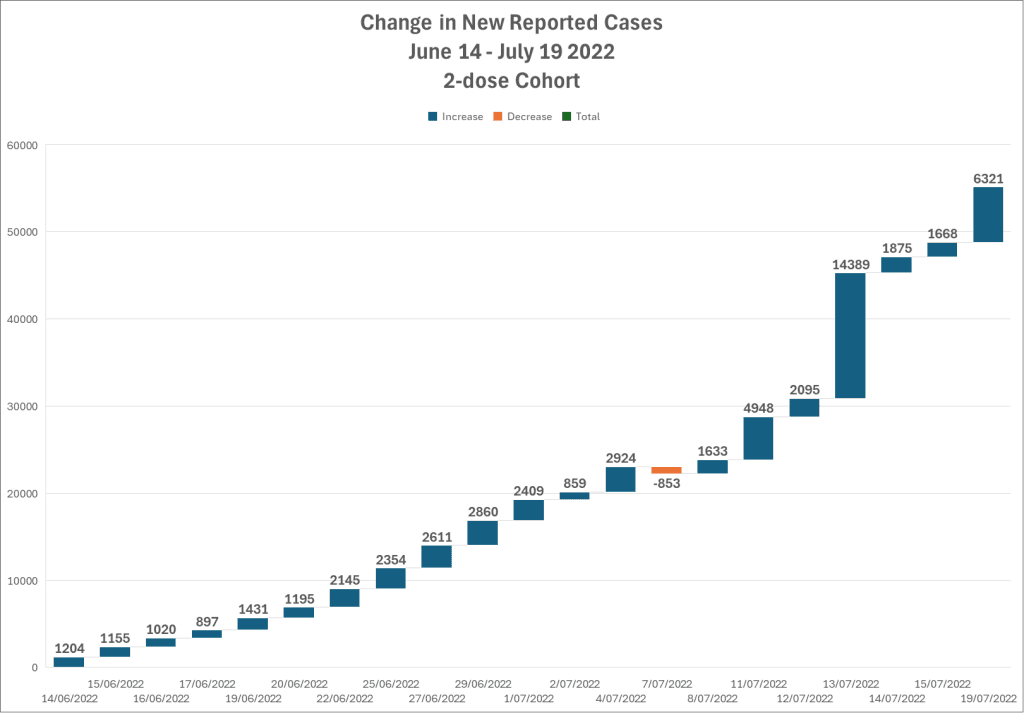
The 2-dose (Fully Vaccinated, yay!) cohort, they have a little drop of -853 on the 4th-7th transition, but their bump back on the 13th-14th is 14,389. Just 53 more cases than were gifted to the Unvaccinated on the 7th.
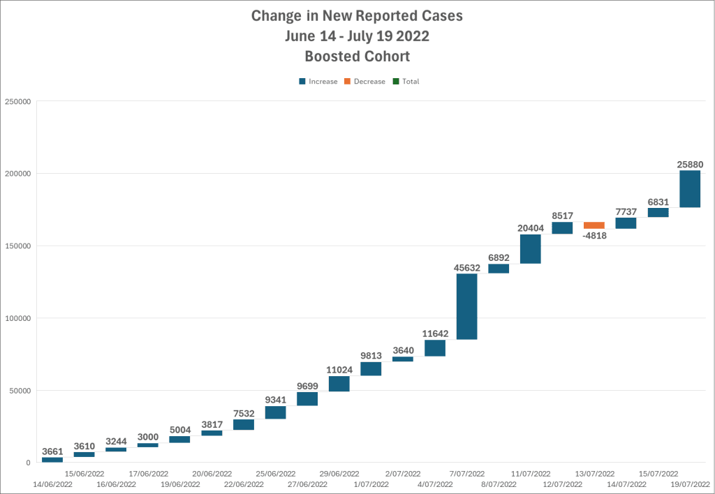
The Boosted cohort? Well.. on the 7th it also takes a bit of a huge jump, not as large a relative change as the 0-dose did (but much more raw), I suspect it won’t be reversed quite as much either. Nope. Drops by 4,818 on the 12th-13th transition.
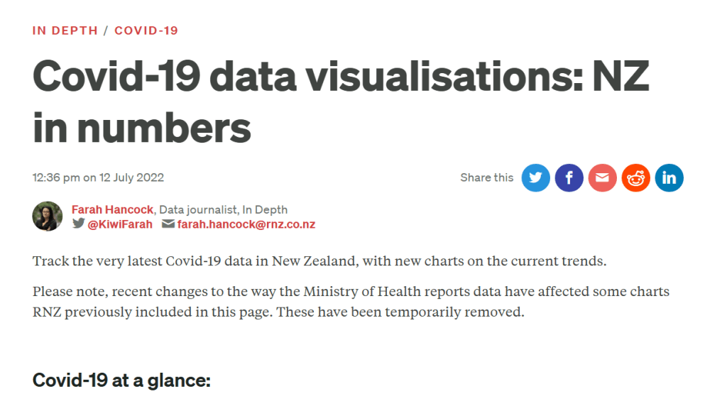
I thought it might be interesting to see what RNZ was reporting at the time:
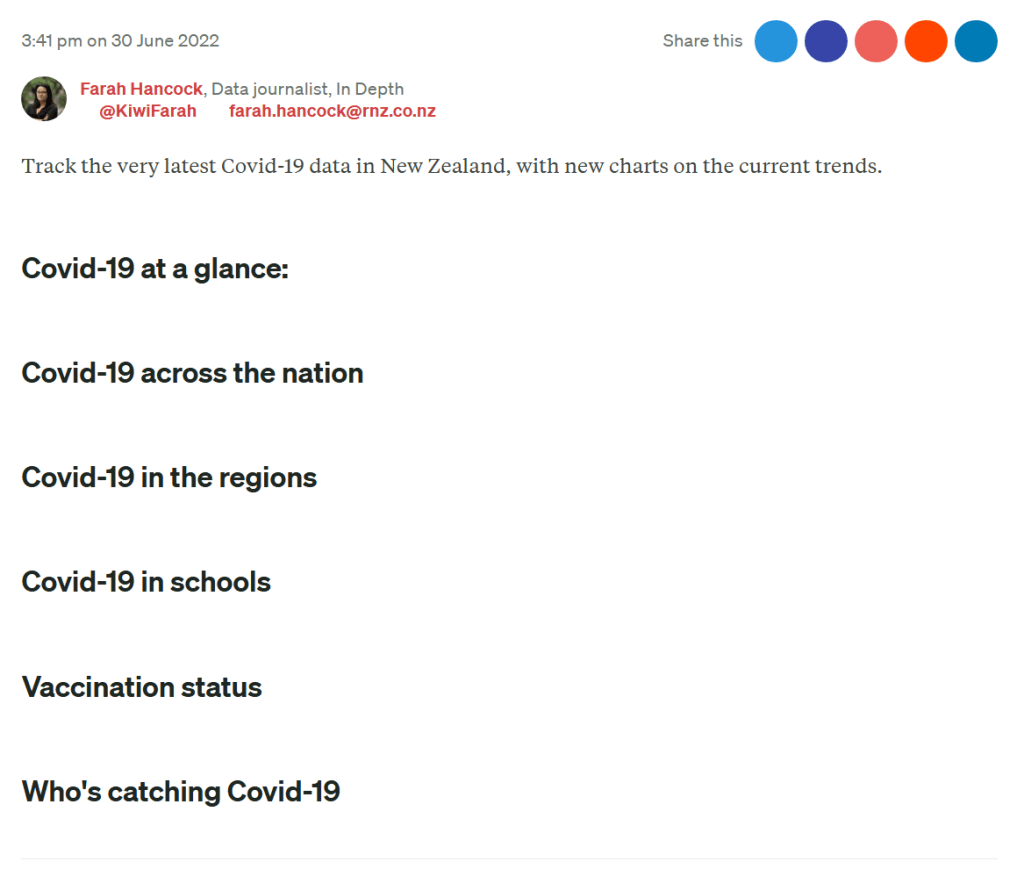
30 June, the (awesome at the time) RNZ Charts page had new charts! From memory (as they are gone now) they showed us cases by vaccination status.

3 July, Michael Baker was warning of another Wave.

4 July:

6 July:
7 July:
8 July:
9 July:

13 July (the day tens of thousands of cases were correctly allocated away from the 0-dose cohort):
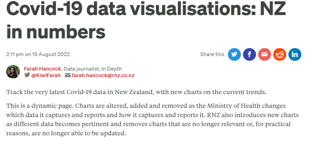
Apparently, “temporarily” in RNZ language means “Permanently.” Now, going through the data day-by-day as I have, I notice no “change to the way” it is presented, aside from the pretty obvious fudging.
A month or so later: Now, these charts don’t just vanish when you stop adding data to them. They have to be manually deleted. Wouldn’t it be interesting to see why this was actually done?
I’ll have to do this waterfall chart for the whole thing now. Awesome!