Thursday, July 10, 2025
32 °c
Moses Lake
21 ° Thu
23 ° Fri
SCNZ
No Result
View All Result
  • Home
  • Covid

    We often hear “how many lives were saved”, how many Dollars were Saved (on pensions) in NZ over Covid?

    A look Back at NZ’s “Fifth Wave of Covid” by Vaccination Status

    What Word is Missing From Recent Article on Reducing Infection to Avoid Long Covid in Children?

    What the Data Shows: Stolen vs Public Vaccine Data in New Zealand

    What the Public Data Shows: Deaths with Covid vs Deaths with Vaccine in New Zealand

    What the Public Data Shows – Deaths within 30 days of Covid Vaccination in NZ

    NZ Covid Vaccine Rollout – by Age Group and Dose number – Feb 2021-May 2025

    What the Data Shows: How Policy Nudged the Vaccine Uptake Curves

    What the Public Data Shows – Vaccine Rollout vs Cases/Hospitalisations and Covid Deaths

  • Crime

    Family Violence in New Zealand – Violent Offending by Family Member by Ethnicity – June 2024 – May 2025

    Family Violence in New Zealand – Violent Offending by Family Member by Ethnicity – May 2024 – April 2025

    Crime in NZ – Offending by Offence Type and Ethnicity – May 2024 – April 2025

    Crime in NZ – Who are the Victims of Crime? – Victimisations March 2024 – April 2025

    Youth Offending Reducing in New Zealand?: An Analytical Review (2010–2023)

    Analyzing New Zealand’s Crime Trends: 2015-2024

    Drug Crime in New Zealand, Trend Analysis: 2015 – 2024

    Sexual Offense Charges in New Zealand: A Decade of Trends by Sex, Ethnicity, and Victim Demographics

    Crime in NZ – Transgender Incarceration Rate Comparison

  • Opinion

    Why Age-Standardised Mortality Rates for Modelling Covid Mortality Expectations is Wrong

    A Letter to the Minister of Health about Concerning Trends vis-a-vis Vaccine Rollout and Covid Deaths

    The Problem with Counting Lives ‘Saved’

    Framing the Question: Why Most People Get AI Wrong

    Grok, Guardrails, and Gaslighting

    US Supreme Court Rules Puberty Blocker Access for Children not a Right – What’s Happening in NZ?

    Wokeness Unveiled: A Gender-Critical Perspective

    New Zealand Social Media Age Restrictions Compared to Australia, Europe and US Policy

    The Prioritised Ethnicity System in New Zealand – A Primer

  • Shop
PREMIUM
FREE
  • Home
  • Covid

    We often hear “how many lives were saved”, how many Dollars were Saved (on pensions) in NZ over Covid?

    A look Back at NZ’s “Fifth Wave of Covid” by Vaccination Status

    What Word is Missing From Recent Article on Reducing Infection to Avoid Long Covid in Children?

    What the Data Shows: Stolen vs Public Vaccine Data in New Zealand

    What the Public Data Shows: Deaths with Covid vs Deaths with Vaccine in New Zealand

    What the Public Data Shows – Deaths within 30 days of Covid Vaccination in NZ

    NZ Covid Vaccine Rollout – by Age Group and Dose number – Feb 2021-May 2025

    What the Data Shows: How Policy Nudged the Vaccine Uptake Curves

    What the Public Data Shows – Vaccine Rollout vs Cases/Hospitalisations and Covid Deaths

  • Crime

    Family Violence in New Zealand – Violent Offending by Family Member by Ethnicity – June 2024 – May 2025

    Family Violence in New Zealand – Violent Offending by Family Member by Ethnicity – May 2024 – April 2025

    Crime in NZ – Offending by Offence Type and Ethnicity – May 2024 – April 2025

    Crime in NZ – Who are the Victims of Crime? – Victimisations March 2024 – April 2025

    Youth Offending Reducing in New Zealand?: An Analytical Review (2010–2023)

    Analyzing New Zealand’s Crime Trends: 2015-2024

    Drug Crime in New Zealand, Trend Analysis: 2015 – 2024

    Sexual Offense Charges in New Zealand: A Decade of Trends by Sex, Ethnicity, and Victim Demographics

    Crime in NZ – Transgender Incarceration Rate Comparison

  • Opinion

    Why Age-Standardised Mortality Rates for Modelling Covid Mortality Expectations is Wrong

    A Letter to the Minister of Health about Concerning Trends vis-a-vis Vaccine Rollout and Covid Deaths

    The Problem with Counting Lives ‘Saved’

    Framing the Question: Why Most People Get AI Wrong

    Grok, Guardrails, and Gaslighting

    US Supreme Court Rules Puberty Blocker Access for Children not a Right – What’s Happening in NZ?

    Wokeness Unveiled: A Gender-Critical Perspective

    New Zealand Social Media Age Restrictions Compared to Australia, Europe and US Policy

    The Prioritised Ethnicity System in New Zealand – A Primer

  • Shop
No Result
View All Result
SCNZ
No Result
View All Result
Home Covid

A look at the Birth, life, and death of a chart on the MoH Covid Data Page

SpiderCatNZ<span class="bp-verified-badge"></span> by SpiderCatNZ
May 27, 2025
in Covid
Reading Time: 6 mins read
0
5
SHARES
235
VIEWS
Share on FacebookShare on TwitterEmail

As I’ve decided to manually grab every single public Covid-19 data page again, just to complete the collection, I’m going through and noticing things I hadn’t noticed before.

RELATED POSTS

We often hear “how many lives were saved”, how many Dollars were Saved (on pensions) in NZ over Covid?

A look Back at NZ’s “Fifth Wave of Covid” by Vaccination Status

What Word is Missing From Recent Article on Reducing Infection to Avoid Long Covid in Children?

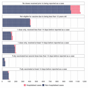
This thing is the inclusion (and later complete removal, a-la those charts on RNZ) of the bar chart on the Case Demographics page that showed cases and hospitalisations by dose count. It began on October 10, 2021.

I imagine the reasoning behind this was something like “If we show them how there are heaps more Unvaccinated than Fully-Vaccinated, that will be a good nudge to the hesitant. This will make taking the vaccine look like a better idea than not taking it.”

October 10, 2021 graphic of outcomes by dose count

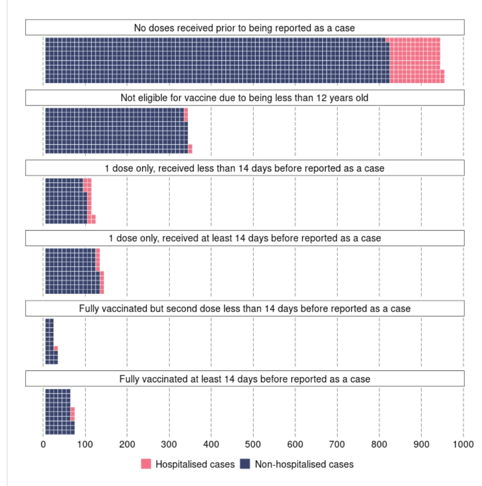
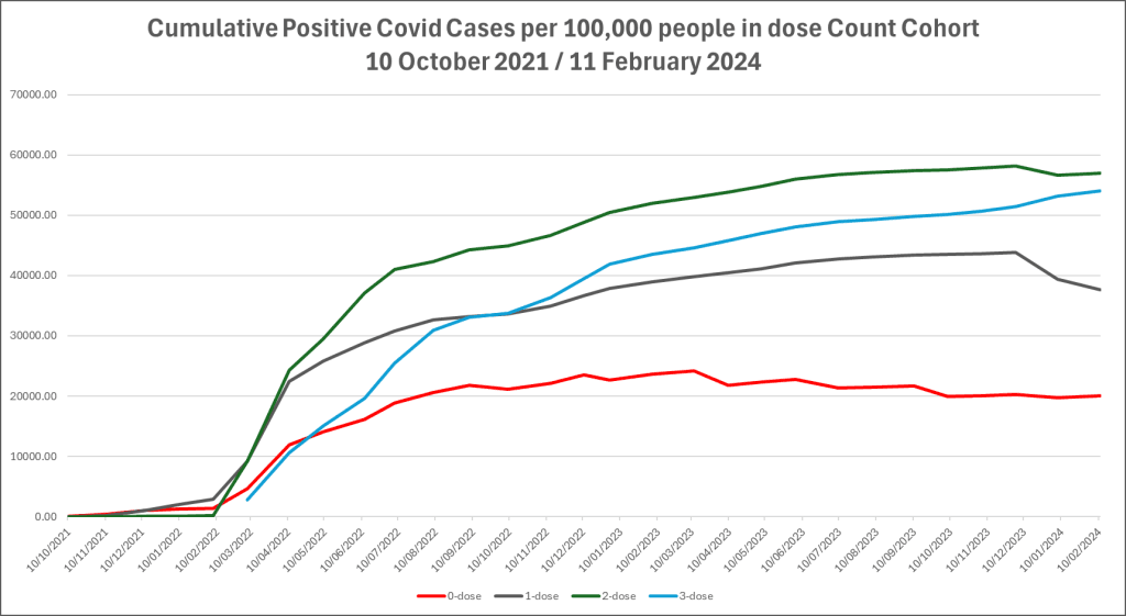
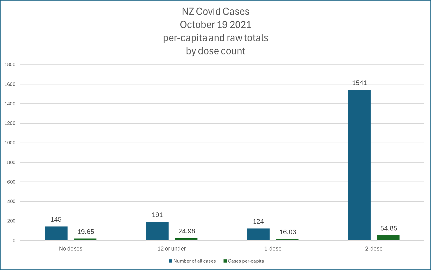
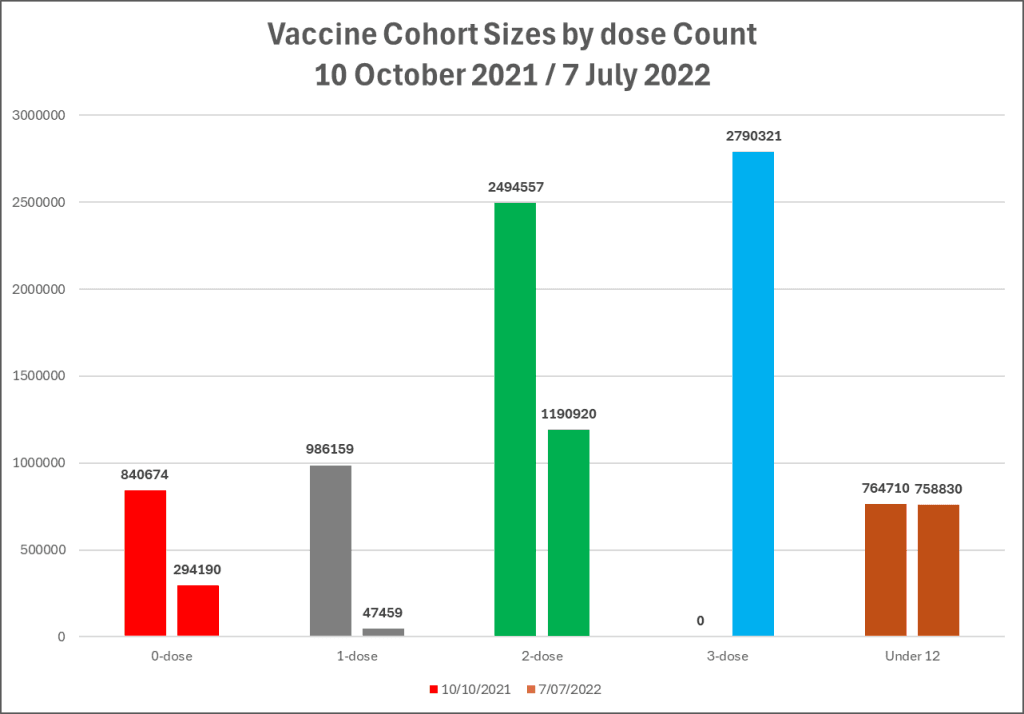
Given that 2021 was within the period covered by the HSU daily dose count spreadsheet, it’s easy to calculate the cohort sizes for that date, then the per-100,000 for each group. Definitely, not looking great for the 0-dose, but bear in mind this includes all of the cases recorded while there was no vaccine available.

This continued, for every day there was a new count (the first week or two was only updated twice, then it was every time), until the 7th of July 2022, it was gone.

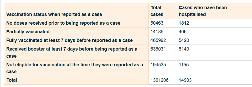
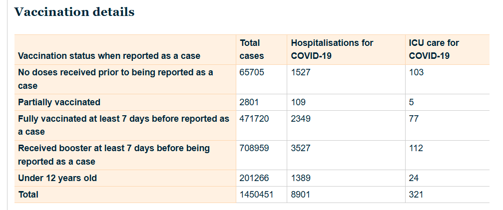
On the 4th of July 2022, the final day it was posted, it looked like this:

July 4, 2022 graphic of outcomes by dose count.

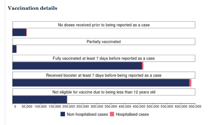
Looking at the per-100,000 people rate for positive cases at that date, I think I can imagine why they decided to stop showing it.

Become a Member Become a Member
ADVERTISEMENT

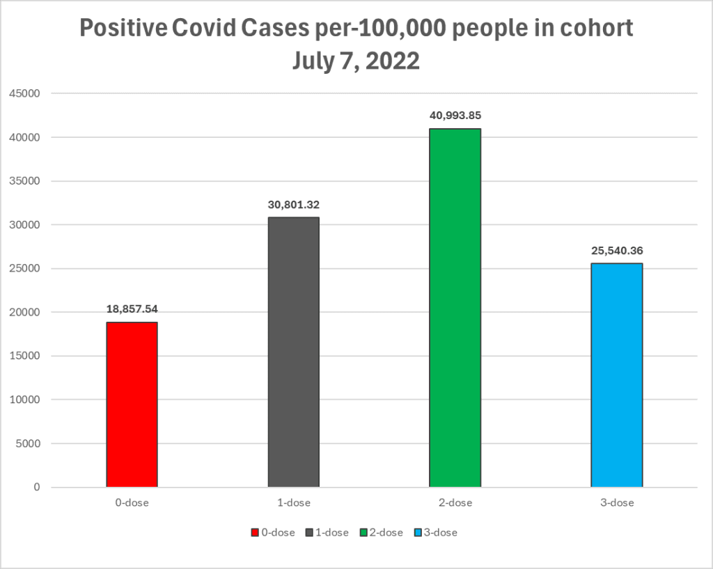
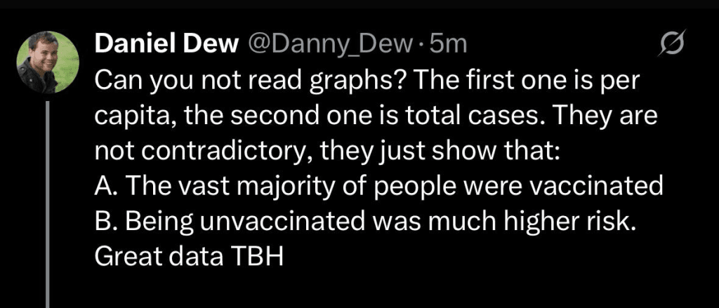
I was going to make this post a while from now, when I have all the dates in the spreadsheet, but Daniel on X doesn’t seem to understand why the addition of the chart to begin with, then its removal when it was removed, is significant. While he is correct about the number of people vaccinated/boosted compared to the 0-dose, he seems to be missing the point that, although the population was heavily vaccinated against Covid, it was those heavily vaccinated cohorts that were catching Covid at a rate higher than the unvaccinated.

It all comes down to the actual RATE of infection.

For every 100,000 unvaccinated people, in the beginning, it was quite high. But as time went on, the 2-dose group eclipsed them. Not because there were more 2-dose people, but because out of every 100,000 people who took 2 doses, more were getting the very disease they were being vaccinated against, than those who didn’t take any doses.

Then came the Boosted. July 2022, when this chart stops, they had already overtaken the all-time Unvaccinated rate, and their counter didn’t even start until March 1, 2022.

So, thanks Daniel. I do think this data is great.

*Update* Dan’s back!

Righty, let’s take a look at Daniel’s expert analysis and math ability.

  1. Is 294,000 equal to 0.7% of 4,200,000? Let’s see. 294,000/4,200,000 = 0.1225. 0.1225*100 = 12.25%. Not really the best start for Dan. Also, it doesn’t actually represent the true cohort sizes for any of the groups. That’s because I only have the ability to calculate cohort sizes based on the number of doses given. HNZ internally updates actual cohort sizes when the vaccinated ones die, but this is not published. I saw one mention of it in a DPMC document, 38,000 dead vaccinated in total.
  2. Was the 12+ population at the time equal to 4,200,000? No. I get 4,335,950. Why say “roughly” when the exact number is available? Gee, Daniel, it’s really not looking like you know what you are talking about.
  3. Now, as for the part about the percentage totals.. that’s fun, because that week is one of HNZ/TWO’s “lets totally mess with the figures” weeks. Maybe that has something to do with why the chart was removed?
4 July 2022 Case Demographics, probably correct.
7 July 2022 Case Demographics (the day Hospitalisation definition changed) – reallocations happened, huge jump in 0-dose cases.
8 July 2022 Case Demographics
11 July 2022 Case Demographics
12 July 2022 Case Demographics – 0-dose at 66k, a figure the cohort would not truly reach until the last week of October 2022, by which point the Boosted would be at 978k.
14 July 2022 Case Demographics – when they corrected it.

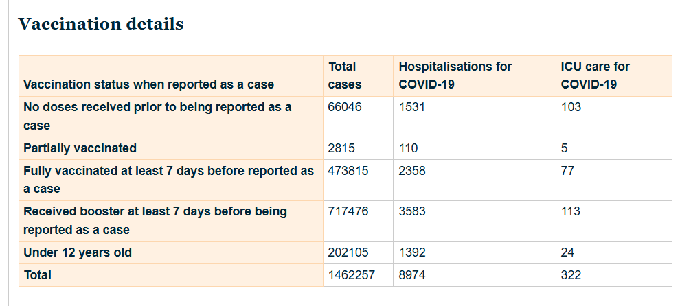
So, I’m not going to calculate the new cases for the week of the 7th of July 2022. It would be pointless.

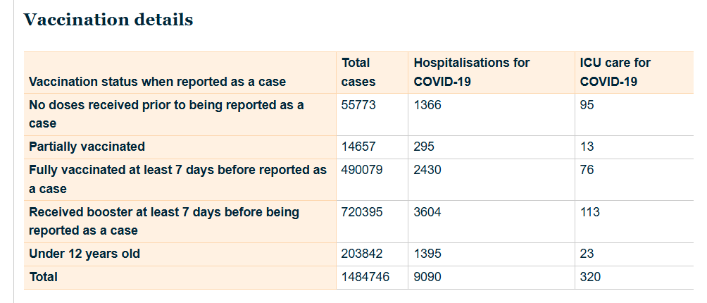
I will do the 4th to the 14th, as they appear to be correct.

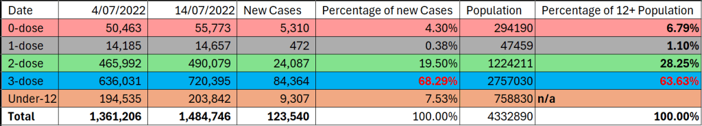
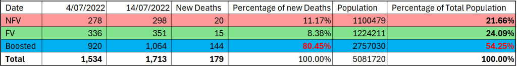
So, for the 10 days from July 4, 2022 to July 14, 2022: A total of 114,223 new cases in the 12+ population.

Some very quick maths, and we see that, of all the cohorts, the ONLY one with a percentage of the new cases for the 10-day period higher than its population percentage is.. the Boosted. I’d lay a shiny Lifetime Membership on the table on the bet that this is the case for at least 95% of all future weeks (or 10-day periods) where the HNZ data quality has not fallen off a cliff.

Just for interest’s sake, let’s look at the new Deaths within 28 Days of a positive Covid Case for the same period. We don’t exclude the under-12s from the population count for this one, and the 0-dose group is joined by the 1-dose group (for “privacy reasons” according to HNZ). As with Cases, the only cohort to have a higher percentage of new deaths for the period than its population percentage is.. the Boosted. By a long, long way.

So, that’s Spidey 2 – Daniel 1/2.

You have to assume he’ll try again. Stay tuned.

Hey! 👋
It’s great to see you're reading this.

Sign up to receive notification via email, when we post new articles

We don’t spam! Read our privacy policy for more info.

Check your inbox or spam folder to confirm your subscription.

Please Share:
Tags: covidstats
Share2Tweet1Send
Previous Post

The Server Kitten has been Playing

Next Post

What is New Zealand’s TRUE Excess Mortality Story?

SpiderCatNZ<span class="bp-verified-badge"></span>

SpiderCatNZ

Iiiiiiiiiiit's me!

Related Posts

Covid

We often hear “how many lives were saved”, how many Dollars were Saved (on pensions) in NZ over Covid?

July 9, 2025
Covid

A look Back at NZ’s “Fifth Wave of Covid” by Vaccination Status

July 8, 2025
Covid

What Word is Missing From Recent Article on Reducing Infection to Avoid Long Covid in Children?

July 6, 2025
Covid

What the Data Shows: Stolen vs Public Vaccine Data in New Zealand

July 5, 2025
Covid

What the Public Data Shows: Deaths with Covid vs Deaths with Vaccine in New Zealand

July 1, 2025
Covid

What the Public Data Shows – Deaths within 30 days of Covid Vaccination in NZ

July 8, 2025
Next Post

What is New Zealand's TRUE Excess Mortality Story?

Data Fudgery or Stats Oddities? Early-mid July 2022

Please login to join discussion

Lost your password?

ai (1) anti-vaxxer (1) censorship (2) cindy (1) covid (42) crime (19) drugs (1) ethnicity (1) excess (1) excess mortality (1) haitian bbq (1) infant mortality (1) liz gunn (1) madness (1) Meltdown (5) MOAR (1) monkeypox (2) mortality (6) oia (1) per-capita (16) psychology (1) racism (1) server (1) side-effects (1) starlink (1) stats (45) terf (1) transmad (1) us politics (1) vaccination (23) vaccine (7) violent crime (1) whistleblower (1) woman (3)

Latest Products

  • SCNZ Platinum Tier SCNZ Platinum Tier $50.00
  • SCNZ Premium Tier SCNZ Premium Tier $10.00
  • SCNZ Ads-Free Tier SCNZ Ads-Free Tier $5.00
  • SCNZ Free Tier SCNZ Free Tier $0.00
  • SCNZ Pet bowl SCNZ Pet bowl $60.00

Categories

  • Covid (43)
  • Crime (24)
  • News (5)
  • Opinion (40)
  • Premium Content (3)
  • Spider Cat NZ (7)
    • MidJourney (2)
  • Uncategorized (6)

Recent Posts

  • Why Age-Standardised Mortality Rates for Modelling Covid Mortality Expectations is Wrong
  • We often hear “how many lives were saved”, how many Dollars were Saved (on pensions) in NZ over Covid?
  • A Letter to the Minister of Health about Concerning Trends vis-a-vis Vaccine Rollout and Covid Deaths

Categories

  • Covid
  • Crime
  • MidJourney
  • News
  • Opinion
  • Premium Content
  • Spider Cat NZ
  • Uncategorized

“If they take the vaccine, they'll still get Covid, it just means they won't get sick and they won't die.”

— Jacinda Ardern

© 2023 - 2025 Spider Cat NZ.

No Result
View All Result
  • Home
  • Covid
  • Crime
  • Log In
  • Register

© 2023 - 2025 Spider Cat NZ.

Are you sure want to unlock this post?
Unlock left : 0
Are you sure want to cancel subscription?