


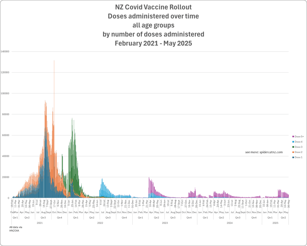
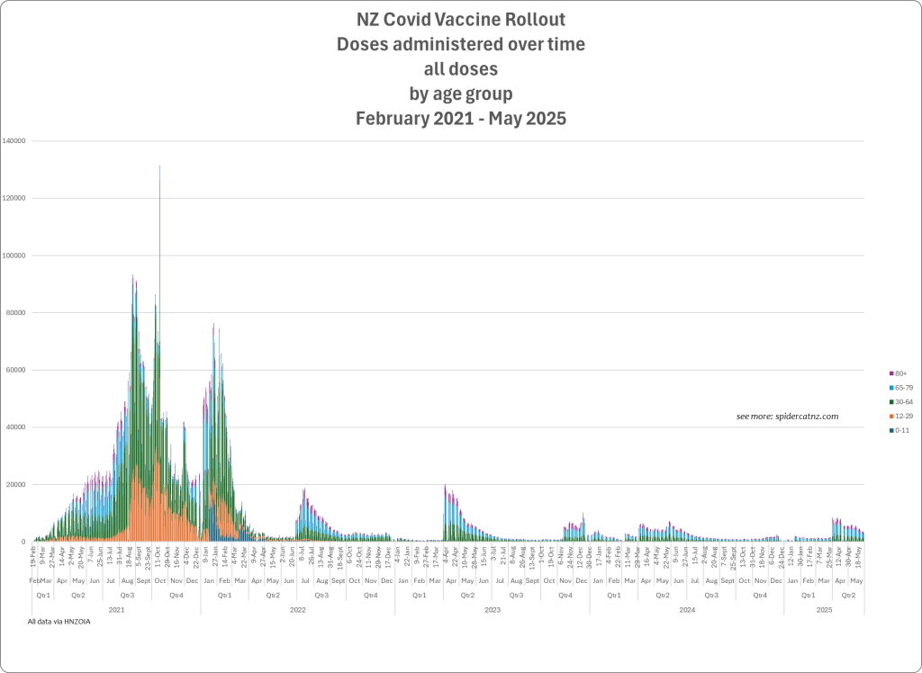
Vaccine Rollout by Dose Number and Rollout by Age Group
NZ Covid Outcomes 2021 – 2025
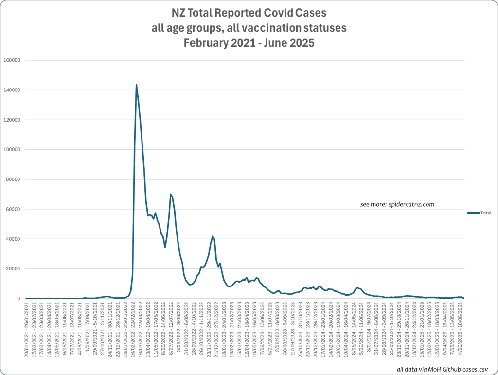
Cases
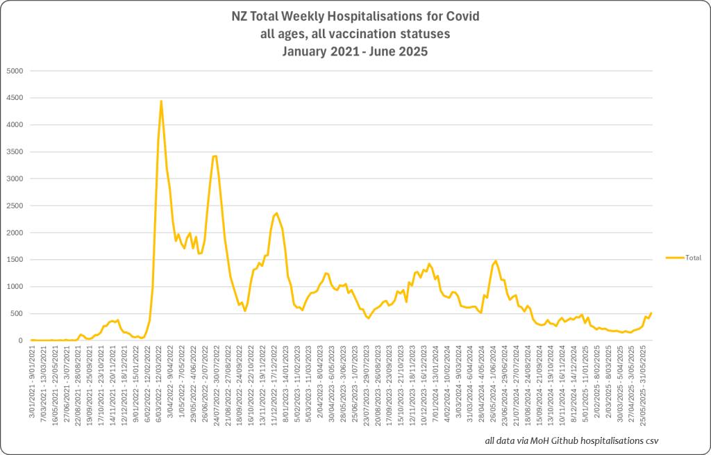
Hospitalisations for Covid
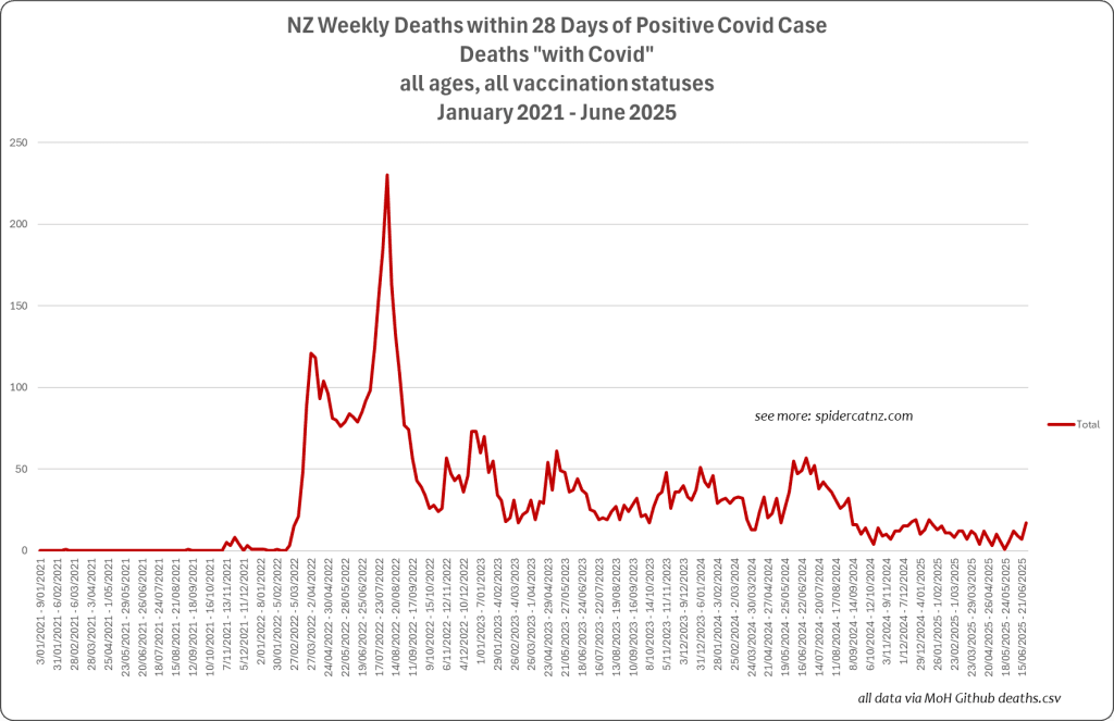
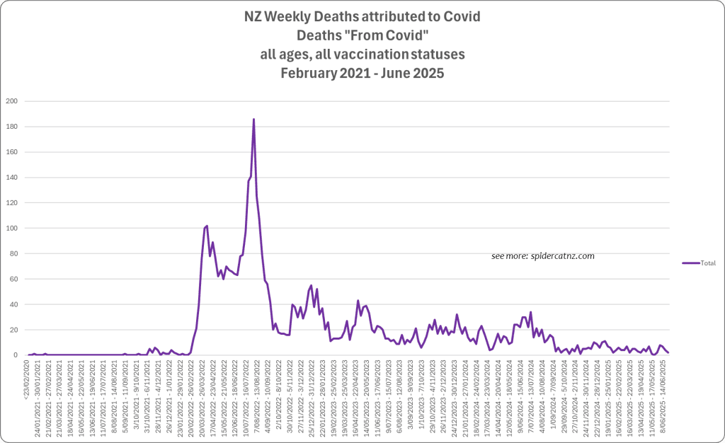
Deaths

Vaccine Rollout by Dose Number vs Outcomes
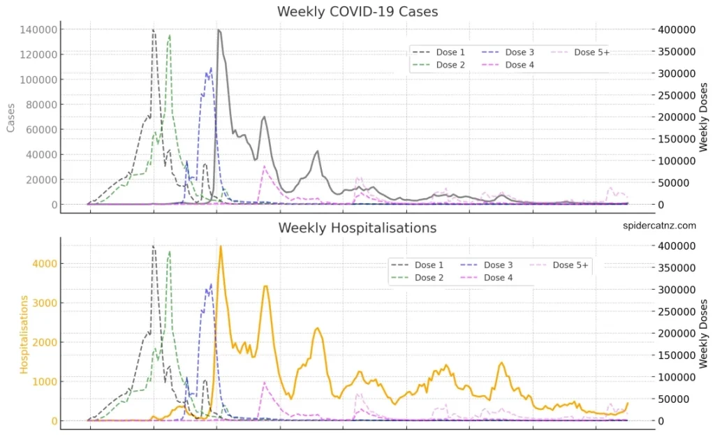
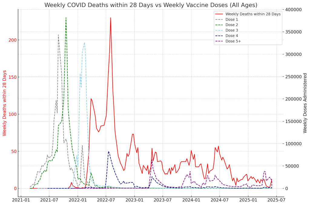

These charts, showing all age groups (we’ll do the age-breakdown in a later post), show the NZ Covid Vaccination rollout by dose number, plotted against Covid Cases, Hospitalisations for Covid, and Covid Deaths (with and from). Some of those slopes and pointy bits look similar, no?
This set of four aligned charts shows the relationship between COVID-19 vaccine rollout by dose number and four different COVID-related outcomes over time in New Zealand:
- COVID-19 Cases
- Hospitalisations
- Deaths within 28 Days of a Positive Test
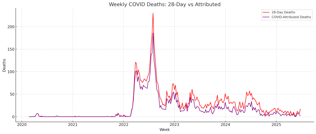
- COVID-Attributed Deaths
Each outcome (solid line, left axis) is shown against weekly vaccine doses administered (dashed lines, right axis), split by dose number (Dose 1 to Dose 5+).
Observations
🟢 Initial Surges: Cases and Dose 1/2
The first spike in cases closely tracks the rollout of Dose 1 and Dose 2 in late 2021. This suggests a strong temporal overlap between the initial vaccination campaign and the first wave of COVID-19 spread.
🔵 Dose 3 and Extended Impact
Dose 3 appears to extend the period of elevated cases and align more strongly with the rise in hospitalisations. This is especially visible in the second chart, where hospital admissions increase in step with the booster rollout.
🔴 Deaths Spike After Dose 3 — Not Before
The largest surge in deaths within 28 days (third chart) does not align with the initial case or hospitalisation spike, but instead follows the rollout of Dose 3, with a pronounced peak in early 2023. This was also the highest per-capita deaths per dose in the 80+ group, as shown in earlier charts.


🟣 Attributed Deaths Mirror Elderly Booster Campaigns
The fourth chart shows COVID-attributed deaths rising again in 2023 and 2024, a pattern that visibly mirrors the administration of Dose 4 and 5+ — which were primarily targeted at the elderly. However, as noted earlier, the Ministry of Health’s reclassification of COVID deaths in July 2022 likely causes this curve to understate mortality in later waves.
The below sections explain Correlation analysis, Pearson (what things moved at the same time) and Granger (did a change in Vaccination result in a change in an outcome?):
Correlation Analysis – Pearson and Granger
Pearson Correlation – What Moved Together at the same time?
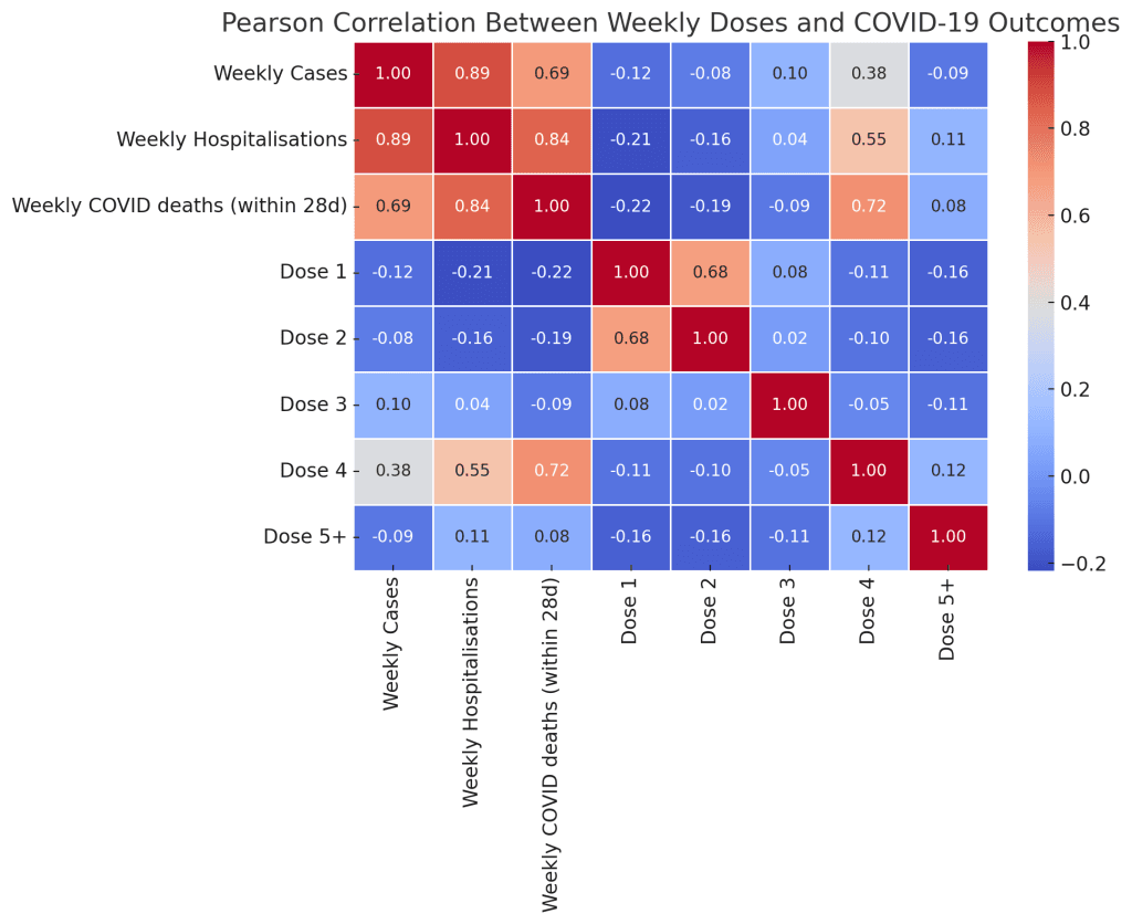
📊 What is this chart?
This is a correlation matrix showing how strongly two things move together over time, for every pair of variables shown. These are Pearson correlation coefficients, which range from:
- +1.00 → perfect positive correlation (they move exactly together)
- 0.00 → no linear relationship
- –1.00 → perfect negative correlation (one goes up when the other goes down)
Each square (or “cell”) shows the correlation between the row variable and the column variable.
🧠 How to read it
- The rows list three outcome types:
- Weekly COVID Cases
- Weekly COVID Hospitalisations
- Weekly COVID Deaths (within 28 days)
- The columns list:
- The same outcomes (to show internal correlations)
- Weekly doses given for each Dose Number (1 through 5+)
You read across a row to see how strongly that outcome (cases, hospitalisations, deaths) is associated with each dose type.
🔍 What does it show?
✅ Strong expected relationships:
- Cases ↔ Hospitalisations: Correlation = 0.89
- Hospitalisations ↔ Deaths: Correlation = 0.84
These are high because rising cases often lead to more hospitalisations and deaths.
💉 Doses vs Outcomes:
Dose 4:
- Most strongly correlated with all outcomes:
- Cases = 0.38
- Hospitalisations = 0.55
- Deaths = 0.72
This means that when Dose 4 administration increased, deaths within 28 days also increased in the same weeks. The chart doesn’t tell us why — just that they rose together.
Other doses:
- Dose 1, 2, and 3 show weak or negative correlations with outcomes.
- For example, Dose 1 vs deaths = –0.22
- This likely reflects the timing — Dose 1 & 2 were administered early in the pandemic, before most deaths occurred.
Dose 5+:
- Weak, mostly flat correlations with cases/hospitalisations/deaths.
- Possibly due to it being given at lower volume and to more selective subgroups (e.g. elderly).
🧩 Summary:
- Dose 4 has the strongest contemporaneous relationship with mortality.
- Earlier doses (1–3) were not closely aligned with peaks in deaths/hospitalisations.
- This chart does not prove causation — only co-movement.
Lagged Pearson Correlation
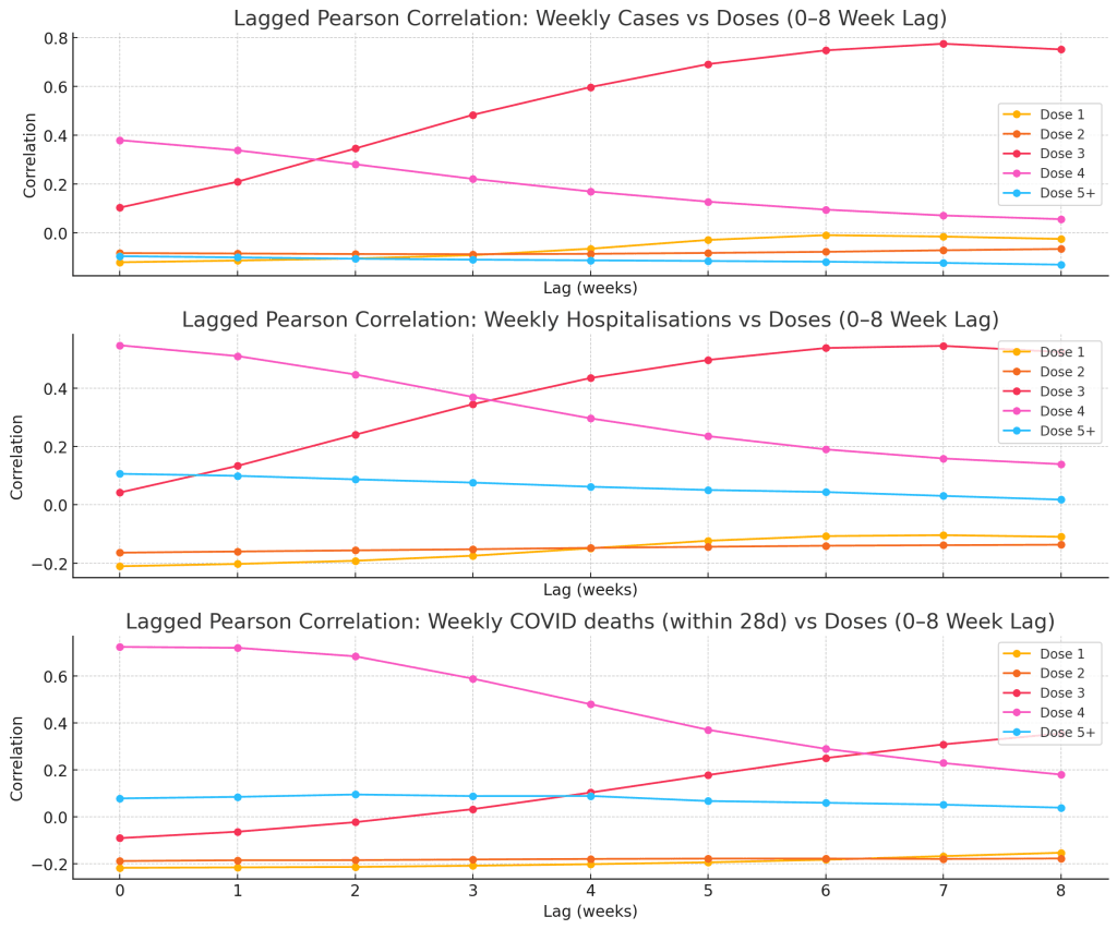
📊 What is a lagged correlation matrix?
A lagged Pearson correlation chart shows how the relationship between two time series changes when one is shifted forward or backward in time.
- This is useful when asking:
“Do changes in one variable (like vaccination) precede changes in outcomes (like deaths) after a delay?”
Each cell in the matrix shows the correlation coefficient between:
- An outcome (e.g. weekly deaths)
- And a specific dose rollout, offset by a number of weeks (lag)
🧠 How to read it
- Rows: these are the COVID-19 outcomes (cases, hospitalisations, or deaths within 28 days).
- Columns: these represent different lags, like:
- Lag 0 = same week
- Lag +1 = dose given 1 week before the outcome
- Lag +2 = dose given 2 weeks before the outcome
- … and so on.
In effect, each cell tells you:
“How much did outcome X tend to rise or fall L weeks after Dose Y increased?”
🎯 What are you looking for?
- High positive correlation at a certain lag → Suggests the outcome rose following dose activity.
- High negative correlation → Suggests the outcome dropped after dose activity.
- Lag at which correlation peaks = best temporal alignment between dose activity and outcome.
🔍1. Cases vs Dose Lag Correlation
- Dose 4 shows moderate correlation at lag 0, but it decreases over time.
- Dose 3 shows a rising correlation, peaking around lag 7–8 weeks.
- This suggests the pattern of Dose 3 uptake might be followed by a rise in cases 1–2 months later — not necessarily causally, but temporally aligned.
2. Hospitalisations vs Dose Lag Correlation
- Dose 4 shows stronger correlation at lag 0, dropping off later.
- Dose 3 again shows rising correlation as the lag increases, suggesting a potential delayed relationship with hospitalisations.
3. Deaths within 28 Days vs Dose Lag Correlation
- Dose 4 shows its strongest correlation at lag 0, weakening rapidly.
- Dose 3 builds steady correlation toward lag 5–6.
- This may imply that when Dose 3 was administered, deaths within 28 days began increasing in the weeks that followed.
⚠️ Important: Correlation ≠ Causation
Just because two things move together does not mean one causes the other.
For example: a COVID wave could lead to both a surge in cases and a public drive for more vaccinations. The apparent correlation would reflect a shared trigger — not necessarily a causal effect from the dose.
These charts show timing relationships, but not cause and effect.
Granger Causality Testing
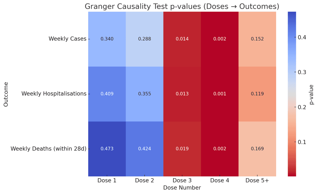
How to Read It:
- Columns = Dose Number (e.g. Dose 1, 2, …, 5+)
- Rows = Outcome types (Weekly Cases, Hospitalisations, Deaths within 28 days)
- Cell values = p-values from the Granger causality test
- A p-value below 0.05 suggests that past doses may help predict the outcome
- A low p-value (e.g., 0.001) indicates strong evidence of Granger causality
- A high p-value (e.g., 0.40) means no statistical indication of predictive effect
Key Observations:
- Dose 3 and Dose 4 both show statistically significant p-values (< 0.05) across all three outcomes:
- Dose 3 → Cases (0.014)
- Dose 3 → Hospitalisations (0.013)
- Dose 3 → Deaths within 28 days (0.019)
- Dose 4 shows even stronger statistical association (all p-values ~ 0.001–0.002)
- Dose 1, Dose 2, and Dose 5+ have much higher p-values, suggesting no statistically detectable predictive effect on outcomes using Granger’s framework.
Lagged Granger Correlation
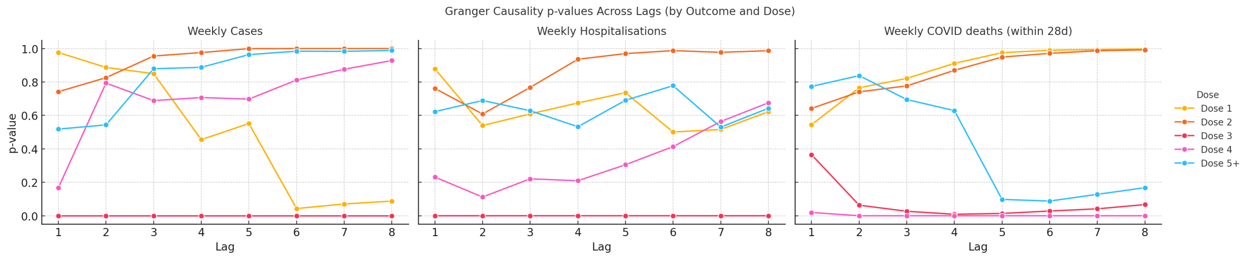
📊 What This Chart Shows: Do Doses Predict Outcomes in the Following Weeks?
This chart explores whether the rollout of COVID-19 vaccine doses is statistically aligned with changes in outcomes like cases, hospitalisations, or deaths in the weeks that follow.
For each outcome (one chart per row), the lines show how likely it is that each dose number (Dose 1 through Dose 5+) “Granger causes” that outcome — which is a technical term meaning “helps predict future changes.”
- The X-axis is how many weeks later we look (from 1 to 8).
- The Y-axis is a p-value — a measure of statistical significance.
- A value below 0.05 means the correlation is unlikely to be random (i.e., “statistically significant”).
- Lower is stronger — it suggests the dose rollout was a possible predictor of the outcome.
🧠 What We See:
- Dose 3 and Dose 4 stand out:
- They show statistically significant p-values across multiple outcomes — particularly hospitalisations and deaths — in the 3 to 5 week lag range.
- This means that when Dose 3 or Dose 4 uptake increased, we often saw a rise in outcomes like deaths or hospitalisations 3 to 5 weeks later.
- Dose 1, Dose 2, and Dose 5+ did not show strong predictive signals — their lines stay well above the 0.05 threshold.
This doesn’t mean the doses caused the outcomes — only that the timing pattern is consistent enough that it helps statistically predict what came next.
Think of it like this: if we were blindfolded and only knew the vaccine rollout numbers, this chart tells us whether we could guess when hospitalisations or deaths might rise — just based on the timing of the rollout.
Coming up..
Age-stratified breakdowns. The cases and hospital files from the GitHub have age breakdown, but Deaths is another matter.