


🧭 Overview
As New Zealand navigated the COVID-19 pandemic, over 11 million doses of COVID-19 vaccines were administered to a population of around 5 million. This analysis investigates the patterns of all-cause mortality in the weeks and months following vaccination, focusing on age-stratified data from the New Zealand Ministry of Health.
The findings aim to contribute to a deeper understanding of how timing and demographic context might affect mortality statistics, without jumping to conclusions about causality.
📊 Key Findings
1. Sharp Mortality Peaks Shortly After Vaccination
Using anonymized data of deaths following the last recorded vaccine dose, we observe:
- A distinct spike in deaths in the first 0–7 days following vaccination, across nearly all doses.
- The spike is particularly noticeable after Doses 1 and 2, which had the highest number of recipients.
- Doses 3 to 5 show persistent elevated death counts into the 8–30 and 31–90 day windows, especially among the elderly.
2. Mortality Concentrated in the 80+ Age Group
When filtering the data to include only people aged 30 and over:
- The 80+ age group dominates short-term mortality following vaccination.
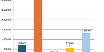
- Over 600 deaths occurred within 0–7 days in this group alone.
- Thousands more were recorded within the 30–180 day post-vaccination period.
- This pattern is consistent with vaccination programs targeting frail and elderly individuals, often in aged-care facilities.
3. Younger Adults (30–64) Showed Relatively Low Mortality
- In comparison, people aged 30–64 showed significantly fewer deaths post-vaccination.
- Fewer than 100 deaths occurred within 0–7 days across all doses in this group.
4. Normalized Death Rates Confirm Real Differences
- When deaths are adjusted for the size of the vaccinated population, Doses 1 and 2 still show the highest short-term death rates per 100,000 recipients.
- Doses 3 to 5 remain elevated, but are more drawn out over time—again suggesting administration to populations with limited life expectancy.
5. Excess Mortality Trends Track with Booster Campaigns
- By comparing weekly excess deaths (deaths above the normal baseline) with vaccine rollout data, we find:
- Noticeable overlaps between the peak of vaccination waves and surges in excess deaths.
- This alignment appears most clear during the third and fourth dose rollout phases.
🧠 Key Takeaways
- Temporal proximity to vaccination does not necessarily imply causation, especially in elderly or terminally ill populations who were prioritized for early and repeated vaccination.
- The clustering of deaths shortly after vaccination is most prominent in those already at high risk of mortality.
- Monitoring and transparency of such data are essential to maintain trust and improve future public health interventions.
🔮 Next Steps
To build on these insights, we suggest:
- Normalize deaths per dose group by population age strata, improving accuracy in risk comparisons.
- Visualize heatmaps showing how mortality patterns evolve by age and time post-vaccination.
- Segment deaths by facility type, if data becomes available (e.g., aged-care vs. community).
- Adjust excess mortality estimates by subtracting direct COVID-19 deaths, revealing unexplained surpluses.
- Perform time-shifted statistical analysis (e.g., Granger causality) to better understand temporal patterns.
Some of these next steps can be found in the next article in this series: Statistical Relationships – Covid Vaccine Doses and Deaths in NZ from 2020 through early 2025