


General Theory/Outline
Every Monday (excepting holidays, when it’s pushed out), the Ministry of Health provides the latest stats for Covid-related things.
I used to focus solely on Deaths by Vaccination Status but now look at Cases, Hospitalisations and Deaths in NZ by Covid Vaccination Status.
As the MoH data is generally presented as raw numbers, and the population groups of the Unvaccinated/Fully Vaccinated/Boosted are different, I needed to be able to also provide what is called “per-100k” graphs. These take the Outcome (say, Deaths), and divides it by the number of people in the group, then multiplies THAT number by 100,000.
This tells us “For every 100,000 people who are from this cohort (eg: Boosted), this is how many die. We then do the same for Not Fully Vaccinated, and Vaccinated cohorts.
This gives a more accurate picture, and avoids things like SImpson’s Paradox, and angry Santa Clause-looking people going on and on and on about coconuts.

The Calculation – Vaccination Status
On Wednesdays, the MoH drops the latest Vaccination data at https://www.health.govt.nz/covid-19-novel-coronavirus/covid-19-data-and-statistics/covid-19-vaccine-data , which I need to determine the Cohort sizes.


I plug the raw numbers for each group into the table, including the Paeds doses (“5-12s” column), and the spreadsheet calculates as follows:


Unvaccinated/0-dose= Population (5,151,600) – total first doses given.
Partially Vaccinated/1-dose = total first doses given – total second doses given
Fully Vaccinated/2-dose = total second doses given – total 3rd (booster) doses given
“Boosted” = all those who have had 3 or more doses.
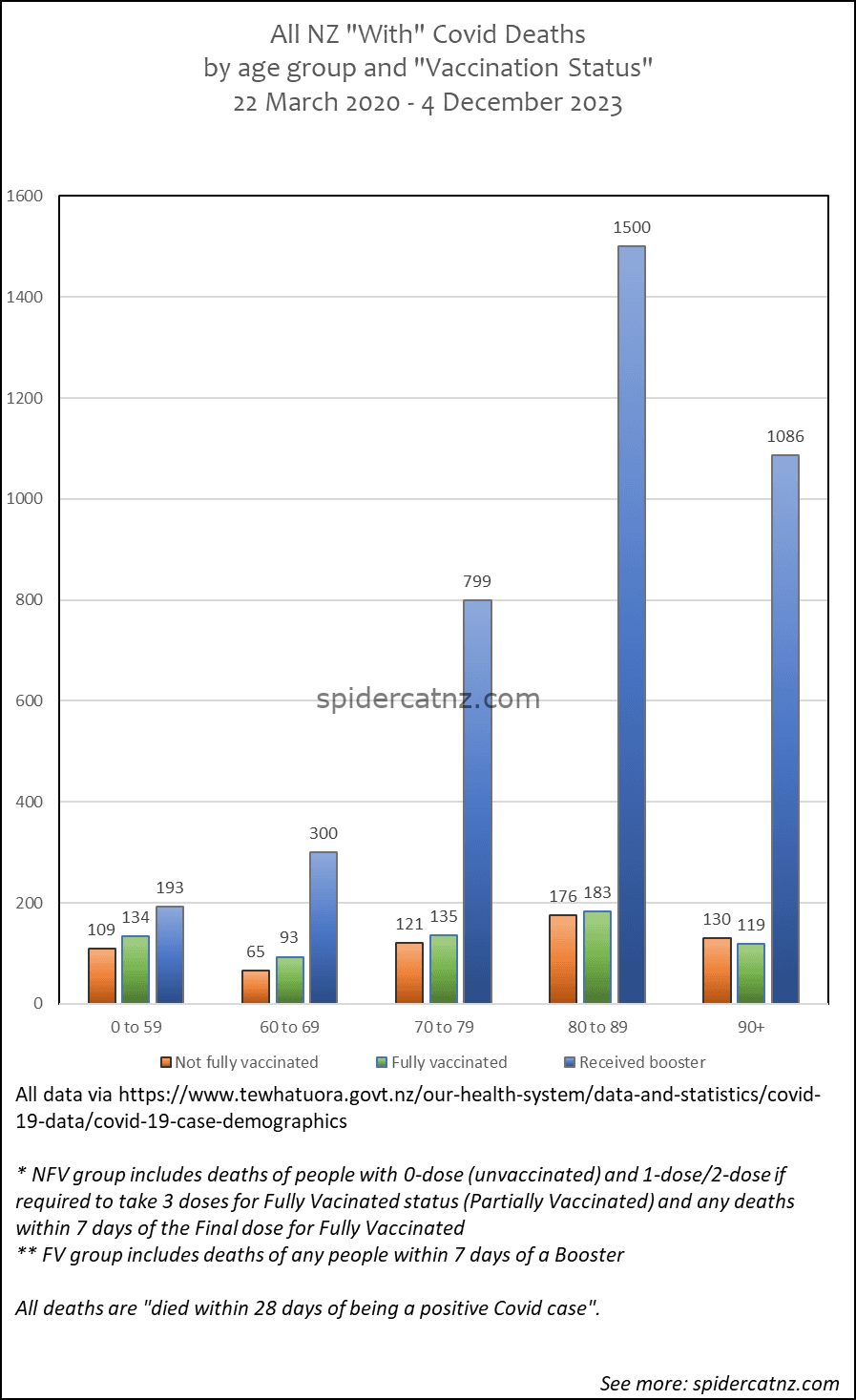
These 4 categories are used for Cases and Hospitalisations. For Deaths, MoH combines the 0 and 1 dose cohorts into one group called “Not Fully Vaccinated”, so I do the same for the Deaths per-100k graph.


The Graphs – Pretty, pretty pictures
The spreadsheet looks like this prior to the drop of the Monday data, showing only the “Overall” Cases/Hospitalisations/Deaths as per the prior week.
Once the new data goes in, the blank graphs populate.
It’s very simple, just take the current number of whatever it is, take away last week’s number, and assuming MoH haven’t messed with the data, you see the change, or New whatever it is.