


💉 What the Data Shows: Deaths Within 30 Days of Dose
What the Data Shows: Deaths Within 30 Days of a COVID-19 Dose
The official New Zealand Ministry of Health datasets now provide sufficient detail to analyse patterns in deaths following COVID-19 vaccination, including deaths occurring within 30 days of any given dose. This article presents findings using mechanically faithful binning and plotting techniques, without inference or smoothing, to visualise what the data shows.
The Source Data
This analysis uses data released under the Official Information Act (OIA) by Health New Zealand, which includes all-cause mortality by dose number and by time since last dose. The dataset includes both vaccinated and unvaccinated individuals, but this specific analysis focuses on those who died within defined time windows after their most recent dose.
The categories are binned by time elapsed since last vaccination:
- 0 to 30 days
- 31 to 90 days
- 91 to 180 days
- 181 to 365 days
- 366 to 729 days
- 730 days and beyond
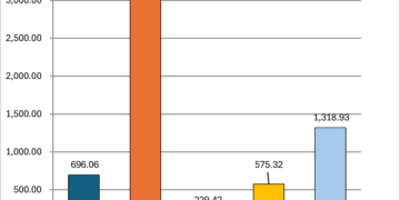
For this type of analysis, a “KCOR-style” chart (referencing the visual popularised by Steve Kirsch) plots the distribution of deaths within each dose cohort across those time bins. Each line represents a dose number (Dose 1, 2, 3, etc.), and each point reflects what proportion of deaths within that cohort occurred in that time window.
Because Health NZ suppresses small values (reporting “<6” instead of exact figures), we show two interpretations:
- Minimum: treating <6 as “1” (minimum possible)
- Average: treating <6 as “3” (a midpoint estimate)
KCOR-Style Chart Findings
Two curves were generated (see chart): one interpreting <6 as 1, and one as 3. The shape of both is broadly the same.


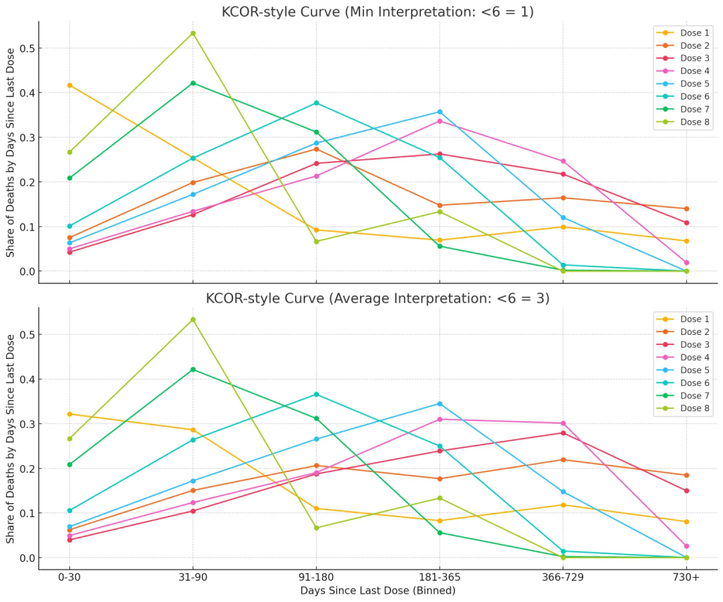
- Higher doses (Dose 4, 5, 6, etc.) show a higher proportion of deaths occurring in the 0-90 day window.
- For many dose cohorts, the largest share of deaths occurred within the first 90 days after vaccination, before declining across the subsequent bins.
- Later doses (Dose 6, 7, 8) show some noise due to small numbers and suppression, but the early peak pattern persists.
This pattern would not be expected to appear as a flat line unless mortality risk was evenly distributed across time, which it rarely is in real-world populations.
Note on Interpreting Flatness:
As some commentators (notably Kirsch) have argued, a “safe” vaccine would produce a flat line across these bins. In reality, no such perfect flatness is ever observed in population mortality data. People do not die at a steady rate across all time intervals; risk varies with age, frailty, time of year, and exposure to other health events. A curve showing variation does not, by itself, imply causality.
Temporal Correlation Analysis
We began by looking at all deaths recorded within 30 days of a COVID-19 dose, regardless of age or dose number. Unsurprisingly, this tracks closely with overall vaccination activity — more doses given means more recent-vaccinated individuals in the population who might die from unrelated causes.
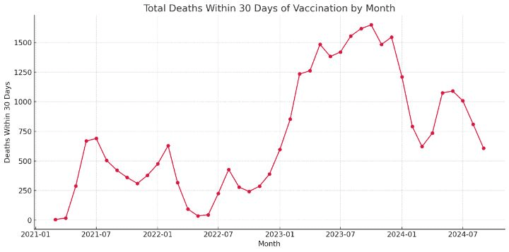
But when we normalize these deaths by the number of doses administered (i.e., deaths per 10,000 doses), a clearer signal emerges.
🧠 Normalized View: Deaths per 10,000 Doses
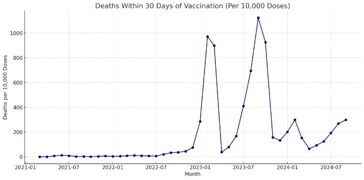
- Early peaks in early 2022 correspond to the first major booster rollout during the Omicron wave.
- A second peak in mid-2022 may reflect dose 4 rollout into aged care settings.
- But a massive spike in late 2023 stands out sharply — especially for Dose 2 and Dose 3 recipients.
That spike exceeds anything seen during the high-intensity 2022 period.
🔍 Where Did That Spike Come From?
To answer that, we broke the data down by dose number and then by age group.
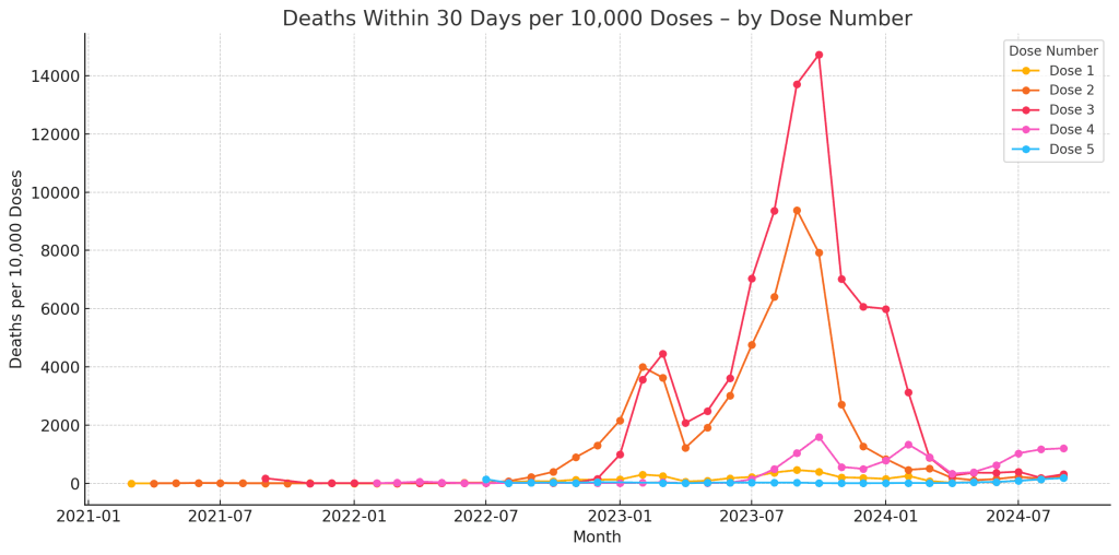
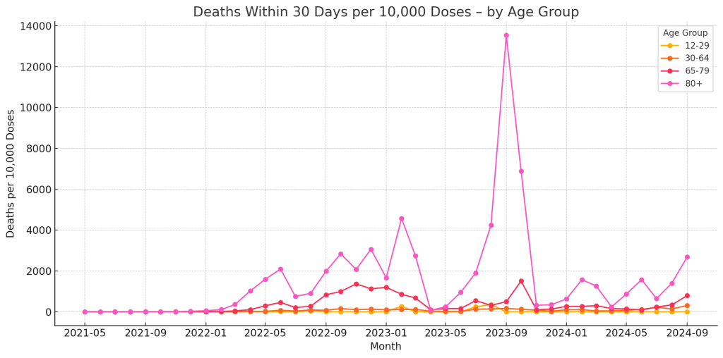
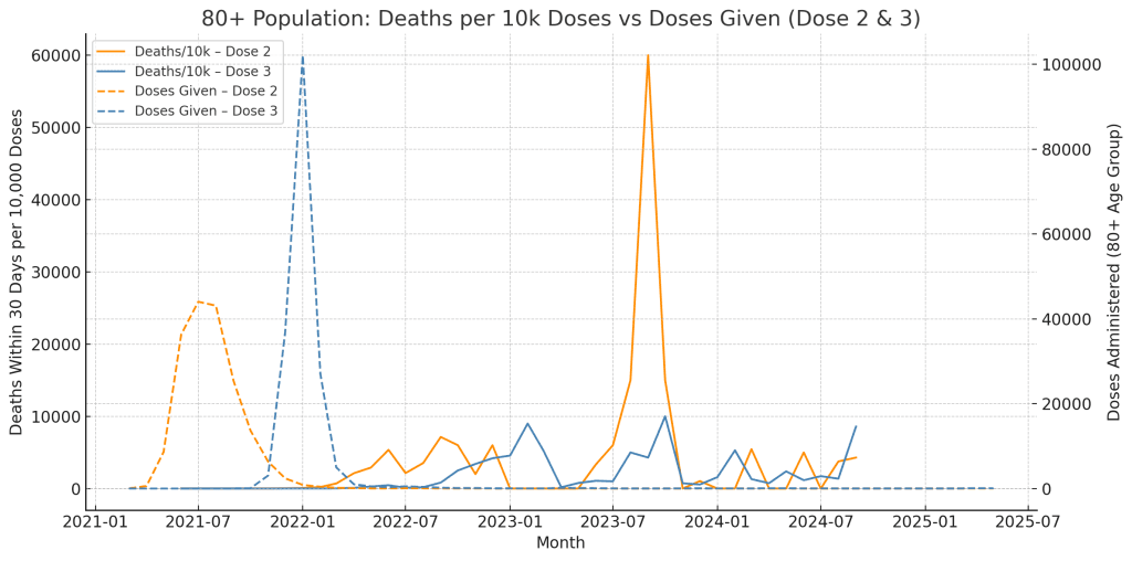
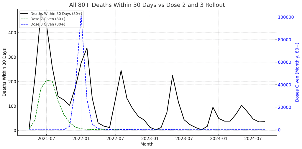
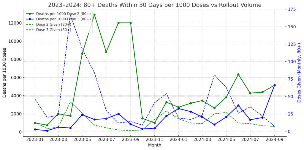
We next analysed deaths within 30 days of a dose by dose number in the 80+ age group, per month. When normalised by the number of doses given each month, the result was striking:
- Dose 2 and 3 saw sharp spikes in late 2023 in deaths within 30 days per 10,000 doses given.
- These spikes far exceeded the peaks seen in early 2022, despite fewer doses being given.
- When broken down by age, it was the 80+ cohort that showed the most significant per-capita rate of deaths within 30 days.
✅ Findings:
- The late-2023 spike in per-capita deaths is almost entirely driven by those aged 80 and over.
- The 65–79 group showed a modest increase, but nowhere near as extreme.
- Younger groups remained flat.
The per-10,000 rate was so high for 80+ in some months that it exceeded 1 death per dose administered — a statistical red flag, but likely explained by the small number of doses and high background mortality in this group.
🦠 Was It Just More COVID?
To test whether the increase was due to a COVID outbreak, we compared it to the Ministry’s record of COVID-attributed deaths in these same age groups over the same period.
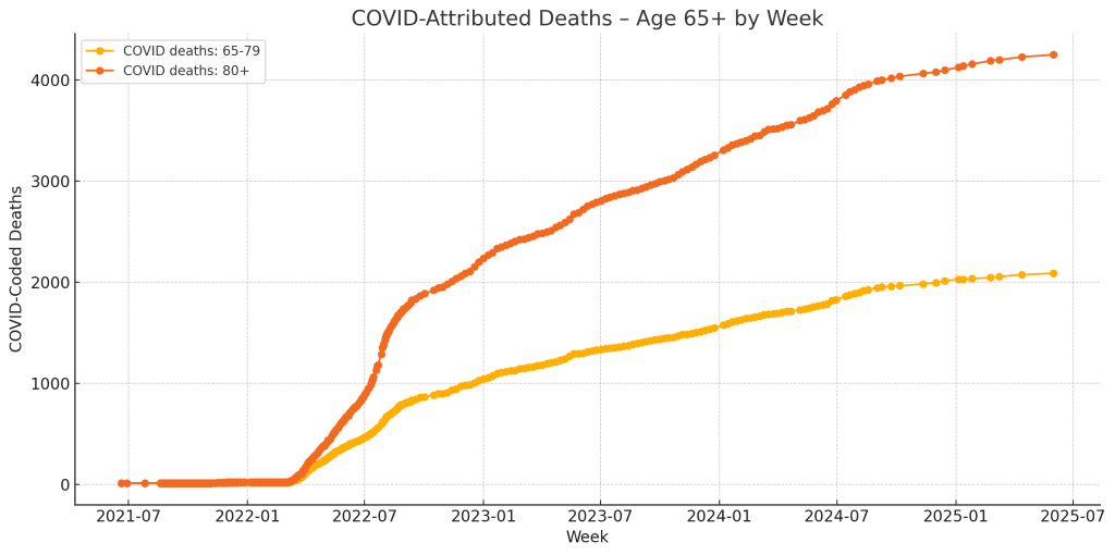
We found:
- No surge in COVID-coded deaths in late 2023.
- COVID mortality in the 80+ and 65–79 groups was stable or declining throughout that time.
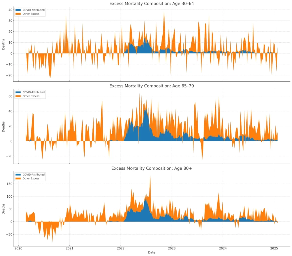
Excess Mortality Comparison
To further contextualise the above, we overlaid:
- Deaths within 30 days of Dose (80+)
- Excess Mortality (80+), calculated as actual deaths minus a rolling 5-year baseline
Result:
- The major spike in late 2023 in deaths within 30 days of Dose 2 and 3 aligned with a spike in excess mortality.
- Prior to this, earlier waves of within-30-day deaths (e.g. 2022) did not coincide with the same magnitude of excess mortality.
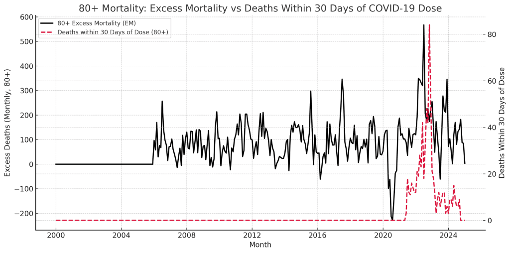
Separately, we compared:
- Excess Mortality (80+)
- COVID-attributed deaths (80+), derived from official cause-coded death counts
Result:
- COVID-attributed deaths spiked in early 2022 but declined sharply after July 2022, following a known change in classification.
- The excess mortality line remained elevated well beyond this, suggesting COVID attribution alone cannot explain later mortality waves.
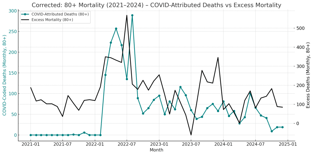
Final Context: COVID-Attributed Deaths vs Excess Mortality
This final chart compares officially COVID-coded deaths in the 80+ age group (teal) against the group’s excess mortality (black), using corrected monthly data derived from a cumulative series.
What it shows:
- COVID-coded deaths peaked in early 2022, especially in January and February, before dropping sharply in July 2022, coinciding with a known reclassification by Health New Zealand that narrowed what was counted as a “COVID death.”
- From mid-2022 onwards, COVID-coded deaths remained low, often near zero, despite sustained or rising excess mortality in the same age group.
- Notably, the large excess mortality spike in late 2023 was not accompanied by a rise in COVID-coded deaths, suggesting that this increase in deaths is not formally attributed to the virus.
Synthesis of All Three Charts
Viewed together:
- The first chart showed that a high proportion of deaths after vaccination occur within 30 days of a dose, especially in older age groups and for later doses.
- The second chart demonstrated that deaths within 30 days of Dose 2 and 3 in the 80+ group spiked in late 2023, aligning closely with excess mortality trends.
- This third chart confirms that COVID itself was not being attributed as the cause of those excess deaths — reinforcing that other factors, potentially including non-COVID causes or misattribution, are responsible.
These observations do not imply causation but highlight a persistent mismatch between mortality timing and formal attribution, meriting further examination — especially for vulnerable age groups.
Conclusion
The Ministry’s own data shows:
- A high proportion of deaths following vaccination occur within the first 90 days of each dose
- A large spike in deaths within 30 days of dose administration occurred in the 80+ cohort in late 2023, especially for Doses 2 and 3
- That spike coincided with a sharp rise in excess mortality, but not with COVID-coded deaths
While this does not establish causation, it raises legitimate questions about cohort risk and vaccine scheduling in vulnerable age groups. Any further analysis should account for the observed time-alignment of dose administration and mortality events.
Limitations:
We cannot disaggregate Dose 5, 6, 7, 8, etc., as current public data aggregates them into “5+”. Similarly, without batch number or location data, finer pattern tracing is not possible at this time. However, an OIA could potentially request this.
This article uses only publicly available, Ministry-released data. No inferences are made beyond what is directly shown.
Since the earliest days of the COVID-19 vaccine rollout, a recurring concern has been the timing of deaths after vaccination — particularly deaths that occur soon after a dose. Early leaked datasets focused heavily on this angle, but lacked important context and completeness.
Now that Health New Zealand has released a complete record of anonymised all-cause deaths with vaccine timing, we can take a clearer, more accurate look.
⚠️ Why This Still Matters
While this doesn’t prove harm from vaccination, it does underscore a key risk in public data interpretation:
Without understanding who is being vaccinated — and when — per-capita death rates can be deeply misleading.
Now that the full data is available, we can see what the earlier leaked dataset hinted at — but with context, stratification, and better visibility.