


In early 2021, New Zealand’s COVID-19 vaccine rollout began with a sense of pragmatic precision. Far from the chaos unfolding in other parts of the world, our small country had the advantage of time — and we used it. Daily updates from the Ministry of Health were a picture of logistical order: doses received, doses administered, and where they were going. Nothing fancy, just the facts.
But by the end of the year, something had shifted. The numbers were still there, but the tone had changed. “Over 90% vaccinated,” the dashboard proudly proclaimed. “Join the movement.” The language had evolved — from describing the campaign to driving it.
This is the story of how New Zealand’s vaccine data reporting transformed throughout 2021 — from a focus on logistics to a subtle, strategic use of influence.
Phase 1: The Logistics Era (Feb–July 2021)
Source: Ministry of Health – COVID-19 Vaccine Data
In the early phase of the rollout, the Ministry of Health’s updates were operational and restrained. Each day brought a tally of how many doses had been given, broken down by district, age, and vaccine type. There were no percentages, no targets, no messaging beyond the numbers themselves.
It was a time when eligibility was tightly managed. Healthcare workers, border staff, and vulnerable groups were prioritised. With so much of the population still waiting, there was little point in broadcasting how far along the nation was. Instead, the updates served more as a progress report for planners than a call to action for the public.
Phase 2: The Percent Pivot (24 August 2021)
Source: Ministry of Health update with percentages – Wayback Snapshot


Then came 24 August. With little fanfare, the Ministry added something new to its dashboard: percentages.
For the first time, people could see how their district stacked up. The figures showed how many residents had received at least one dose or completed the primary course. It was a quiet but powerful shift. No longer just a report card for officials, the data became a source of social comparison.
This is what behavioural scientists call “descriptive norm framing.” The idea is simple: people are more likely to do something if they believe others like them are already doing it. Showing that your region had reached 70% created implicit pressure to keep pace with neighbours.
Overnight, the message changed from “we are rolling out the vaccine” to “your community is stepping up — are you?”
Phase 3: The Vaxathon and the Momentum Play (October 2021)
Source: Vaxathon campaign coverage – NZ Herald
By October, the campaign turned cultural. The government launched the Vaxathon on 16 October — a televised, all-day event designed to energise the nation. It was part concert, part telethon, and entirely focused on boosting vaccination numbers.
The Ministry’s data reporting followed suit. The dashboard began highlighting milestones and regional goals. Words like “Join the movement” and “Help your DHB reach 90%” featured prominently. Live progress bars showed daily tallies. The site became less like a spreadsheet, more like a scoreboard.
Vaccination had become something more than a health decision. It was a symbol of participation — and opting out came with social implications.
The Palmerston North Puzzle
Source: MidCentral DHB clarification – Facebook post
As the campaign approached its peak, questions started to surface. In Palmerston North, claims of 100% first-dose coverage raised eyebrows.
The MidCentral DHB responded by explaining that their figures were based on the Health Service User (HSU) population — a dataset that only includes people who have interacted with the health system in the past year. This method excluded residents who hadn’t recently seen a GP, filled a prescription, or used public health services.
In other words, some of the population simply wasn’t counted — making the vaccinated proportion appear artificially high. In some cases, percentages even exceeded 100% when broken down by ethnicity or age group.
While the numbers were technically correct within the HSU model, they didn’t reflect the total population — a detail that wasn’t always made clear to the public.
The Psychology of Persuasion
Source: Jacinda Ardern summer quote – RNZ
The shift from logistics to influence was no accident. It reflected a broader strategy grounded in behavioural science.
Jacinda Ardern, Chris Hipkins, Michael Baker, and Helen Petousis-Harris were among those who consistently framed vaccination as both a personal benefit and a civic duty.
Ardern warned, “If you want summer, get vaccinated,” and implied that the unvaccinated might miss out on everyday freedoms. Young people in particular were told that without the vaccine, they could miss out on sports, concerts, and social gatherings — activities that anchor youth identity and wellbeing. Hipkins described vaccines as our “biggest weapon” against the virus. Baker and Petousis-Harris pushed for high targets, invoking collective responsibility and long-term outcomes.
These messages weren’t just calls to action — they were carefully crafted nudges. They relied on social proof, urgency, and the desire to be part of the majority.
A Subtle Trade-off
The result? One of the highest vaccine uptakes in the world.
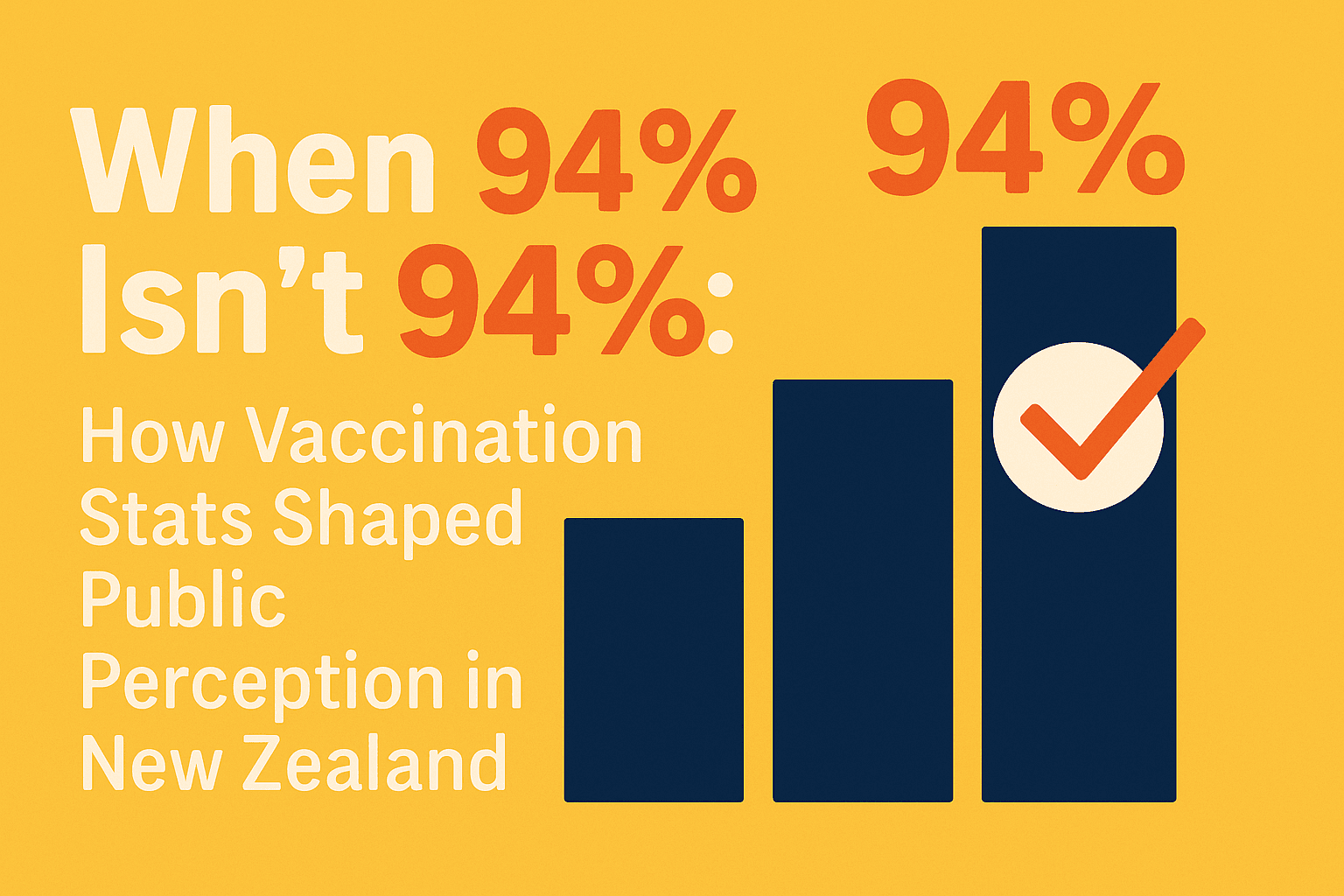
But it came with trade-offs. The use of HSU data made the unvaccinated group appear smaller — and therefore riskier. For example, when 90% coverage was claimed using HSU denominators, the equivalent figure based on total population was closer to 77%. This 13-point gap significantly affected public perception of how few people remained unvaccinated.
Messaging became more motivational than analytical. Percentages rose, trust in the data — for some — declined.
New Zealand’s experience raises an important question for future public health campaigns: how do we balance influence with transparency?
Because in a crisis, the numbers matter. But so does how you tell the story.